Like the war banners of old, your sports logo is a rallying call to fans everywhere, during and after the game. Sports logos have to shoulder more responsibilities than business logos — they’re emblazoned on player custom jerseys, fields, scoreboards, and lots and lots of merchandise. In other words, it takes more than just an angry animal to make a good sports logo (although that’s a good start).
If you want a sports logo that sends shivers down your rivals’ spines, you don’t need the budget of the Yankees. In this article, we explain how to design the perfect sports logo yourself. Let’s start by examining the 10 best sports logos from professional teams and what expert design tips we can learn from them.
10 Best Sports Logos
Dallas Cowboys

The Dallas Cowboys star is considered by many to be the best sports logo ever, and we’re inclined to agree. Its success stems in part from its simplicity — it’s just a star, no garnishes and only one color. It’s not even a stylized star, merely a basic, traditional star.
For one thing, using a simple shape works well for sports because it’s easy to identify on a uniform from far away. But the simplicity of shape also lends more attention to the other visual elements, namely the color and the points of the star. The consistency of color is important for branding, and the Cowboys blue is easy to spot. The sharp points of the star are also great for sports logo because they’re what we call an aggressive shape, as we explain below.
Then there’s the outline, tying it all together. Primarily, this sets apart the Cowboys logo from any other star you might see around, i.e., the Heineken logo. It also gives more attention to the points and frames the logo nicely. Put all these elements together, including the symmetrical aesthetics of a perfect star, and you have a logo that works for both branding and professional sports.
Charlotte Hornets
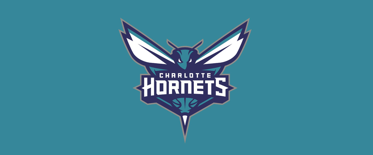
Like the Cowboys logo, The Charlotte Hornets logo also takes advantage of sharp angles. The stinger is obvious (and nicely centered for symmetry), but there’s also sharp points in the wings, on the letters, and even on the antennae.
We also see a regular trope in sports logos, the angry animal logo. A common strategy in sports logos is to “scare” opponents with aggressive imagery (like the sharp points), so threatening animals — even small hornets — are a popular choice. The brows above its eyes are slanted to make it look even angrier, a trick used in cartooning.
Los Angeles Angels
Because they aid in recognition, visual puns are popular in logos of all kinds. The Angels putting a halo around the A isn’t just for charm, it also tells you exactly which team the logo represents, (compared against the Atlanta Braves A, for example).
But even the Angels can’t resist the temptation of a spikey sports logo, and they too add sharp points to the letters for a little nuanced intimidation. Also, notice the two-tone coloring in the lettermark (individual letters) logo — this small touch adds extra depth and visual interest without overcomplicating the design.
Inter Milan
Sports logos aren’t all angry animals and sharp points. Inter Milan (technically the Football Club Internazionale Milano, which explains the letters F, C, I, and M in the logo) designs their logo more like a business than a sports team.
It works, though, in part because of the repeated vertical lines, which represent authority and prosperity by making the eyes move up and down. The sharp angles and straight lines denote strength and stability — good traits for a sports team — while the circular frame brings a unity and collective aspect, important in European sports.
Detroit Red Wings
The Detroit Red Wings logo does a lot different from other sports logos, and that’s what makes it so great. For sportswear branding purposes, it’s good to have a logo that stands out — it grabs attention and improves memorability, ideal for brand recognition. As a bizarre winged, blood-red tire, the Red Wings logo certainly stands out.
But there’s also a lot going on visually that makes it a great sports logo. As an invigorating color, the bold red is a strong choice. Moreover, this logo has a lot more realism and intricate detail than most logos, such as the spokes of the wheel or the jagged feathers. True, those details are hard to notice from the bleachers, but the logo works because its distinct shape is still recognizable from afar.
And don’t forget the sharp angles again, this time in the tips of the feathers.
Buffalo Bills
Aside from the threatening animal and bold red sports logo tropes, the Buffalo Bills logo has some great, unique visuals. The straight, nearly horizontal line from the horns, highlighted with red, gives the impression of fast movement forward — a technique used in comic books. In the context of a buffalo, that makes it appear that the Bills mascot is charging forward.
Also notice how the detailing is done with empty space, rather than extra colors or lines. This adds to the simplicity of the design and keeps the focus on the more powerful elements. Although it’s subtle, this logo also features sharp angles, in this case the patches of fur, hooves, and horn.
AFC Ajax
The logo for the Amsterdam Football Club Ajax, or AFC Ajax, has changed over the years, but the current version is the most praiseworthy. It takes the element of simplicity and uses it to create something detailed, almost paradoxically. Up close, you see the details of their namesake Greek hero, but it’s still clearly visible from far away.
The multi-lined circle frame is also a great addition, with the extra lines adding an extra gravitas. The pairing of black and red, the two most aggressive colors, balances out the white space as well.
Green Bay Packers
Like Inter Milan, the Green Bay Packers opt for a lettermark logo rather than a threatening mascot. The repetition of circles and circular shapes — the green base, the yellow outline, and the curves of the G — strongly emphasize unity and togetherness, and interestingly the Packers are known for their dedicated fanbase of “cheeseheads.”
Lettermark sports logos are great for brand recognition if you can keep them visually interesting. And because this is a sports logo, the green is darkened to a stronger, less-friendly shade.
Winnipeg Jets
A relatively new team to professional sports, the Winnipeg Jets feature a masterfully designed logo. Common themes we’ve seen before include the two-tone shading, multiple circular frames, and lots and lots of sharp angles. The beauty of this logo is how they combine them all in a gorgeous layered design..
This logo also perfectly demonstrates the advantage of symmetry in logos. Only the shading changes from left to right, but that adds to the visual dynamism. The spike cut into one of the circular frames, right at the top, works great for bringing the viewers attention back to the center.
Chicago Bulls
Last but not least, the Chicago Bulls logo shows us how to do sports logo tropes well. Their threatening animal mascot looks especially angry with the thick black lines accenting the slanted brow. The strong red is predominant, and the pitch black accent makes it even stronger.
And like many other sports logos, the focal point is the sharp angles. The main visuals, the horns, are accented by red flourishes, while other parts of the logo — the ear, the muzzle — also feature subtly sharp corners.
How to Design Your Own Sports Logo: 3 Expert Tips
After looking at the 10 best sports logos above, we can notice some expert design techniques at work. You can use these three tips below to make your own sports logo look professional level.
Aggressive Mascots
Some teams can pull off a lettermark sports logo, but most would rather use a terrifying animal. Sports team names and mascots tend to be large and/or predatory animals, or at least aggressive, like the tiny hornet.
But your animal doesn’t need to be scary, as MLB’s Cardinals, Blue Jays, and Orioles show us. You can use design techniques to make them look more imposing. For example, adding sharp angles or narrowed brows will make any mascot just a little more threatening — a great tip is your team is already stuck with a suboptimal name.
Sharp Angles
As we’ve seen lots of sports logos feature sharp angles and spikes. This is no accident if you understand visual flow. Basically, the human eye instinctively follows lines: straight lines make the eye move faster in one direction, creating a sense of quickness and directness, while curvy and circular lines make the “dance,” creating a sense of playfulness.
Sharp angles make the eye dart quickly, a combination of two straight lines going in different directions. They purposefully disrupt the visual flow, making your eye double-back abruptly, and that jarring effect makes the image more imposing and invigorating.
Aside from sports logos, you see this technique used in logos for another industry that values aggression — metal bands. Just look at Metallica’s logo.
Circle Frames
In direct contrast to sharp angles, the circular frame accomplishes the opposite effect: putting the viewer at ease and making them feel comfortable. Because circles never end, the eye is left looping the image over and over, creating a sense of completeness while simultaneously drawing them in like a whirlpool.
The circle frames common in sports logos may be counter-effective to a team’s aggression, but they serve another goal of sports teams: creating a community. Circles represent solidarity and unity, two essential traits for sports fandom. The circular frames of sports logo work in both welcoming newcomers and uniting individual fans together.
How to Make a Sports Logo
Now that you have an idea of what goes into an effective sports logo, the question is, how do you make one? Essentially you have two options: hire someone to design it for you or design it yourself. Both have their own merits and drawbacks, so let’s examine both individually.
Hiring a Designer
Professional designers know by heart all the tips, tricks, and techniques we’ve mentioned above, and then some. When you hire a designer, freelance or from an agency, you’re buying their expertise just as much as their time.
The problem is, no skilled designer works for free. The most glaring downside of hiring a designer is the cost — talented designers charge hundreds or even thousands of dollars for logo design.
Sometimes you can find cheaper alternatives on sites like Fiverr, but those sites have a poor record for delivering what they promised, and there’s tons of ex-Fiverr users who felt they were ripped off. The industry standard for a logo design is around $200, so if someone charges $5, you’re right to be suspicious.
Moreover, even if you have the money to spare, it can be difficult to find the right designer for you. Graphic design is a creative field, so there are innumerable artistic styles to choose from. You have to be sure to find a designer who both understands your vision and is capable of bringing it to life, but that can take time.
Design a Logo Yourself

If you don’t have spare cash in your budget for a logo, don’t despair. While in the past you may have had limited options, nowadays technology has advanced so that virtually anyone can design their own logo using an online logo design tool like logogenie.
In our digital era, design software is less about the technical skill of your hands and more about your creative ideas. You don’t need to master your brush strokes or pencil shading — you don’t even need steady hands. With digital logo makers, all you need is an idea.
Logogenie, and other online design tools, use templates to make design fast and easy, even for first timers. First, you select your industry from the dropdown menu.
We’ve categorized our templates by the needs and demands of the top industries, so finding yours is the first step. Our algorithm will then generate the top choices for your industry.
Simply choose the one you like and start editing. You can customize each template however you want, personalizing your choices for:
- Main images
- Company name and slogan
- Font and typography
- Color schemes
- Text and picture sizes
- Text and picture placement
- Adding new icons
- Layering (putting some images behind or in front of others)
You can choose from our internal library of over 200 icons. A quick glance shows that there are plenty of the intellectual imagery we mentioned above, including trees with rainbow leaves, shield crests, books, graduation caps, and more.
Using a DIY logo maker like logogenie, you can create a professional-tier logo in just minutes. When you’re done, you can buy all permissions and commercial licensing for $24.90, which grants you your logo forever.
While the template-style of design works well for first-timers, you’ll get better results if you bone up on some graphic design basics beforehand. Keep reading our blog for special design tips, straight from expert designers.

