Oh, Facebook. Of all the social media platforms, this one’s the biggest, the most established and most liked. The one where you concentrate the bulk of your business effort. For better or for worse, if you’ve got a business and it’s not on Facebook, you’re missing out on a ton of sales.
And even if you’re not a business, the same principle applies. If you’re a non-profit, not being on Facebook means missing out on cause awareness, “brand” recognition and ultimately, support for your cause. Similarly, if you’re an artist or any other kind of content creator, not having a Facebook profile means lots and lots of people around the world will never see your stuff.
In today’s world, not being on social media will hurt your brand. And of all the social media platforms, not being on Facebook will hurt it most.
Facebook Logos vs. Other Logos
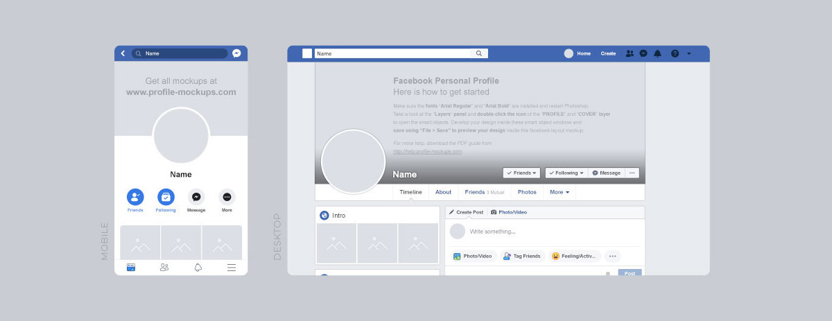
Designing a logo to use on Facebook is like designing a logo to use on any other platform – you need to design something that fits into the spaces Facebook provides without stretching or warping. Your Facebook profile picture is your brand’s “face” on Facebook. It’s the image that shows next to your brand’s name any time you take an action on Facebook, like commenting on a post.
On computer screens, your Facebook profile picture is 170 pixels by 170 pixels. On a smartphone, it’s 128 pixels by 128 pixels.
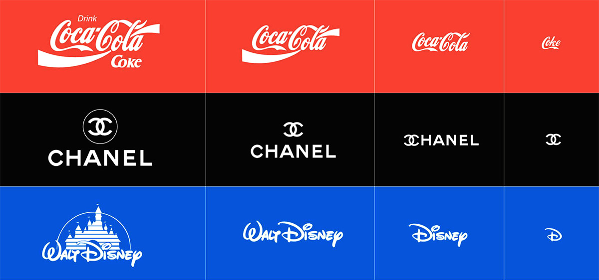
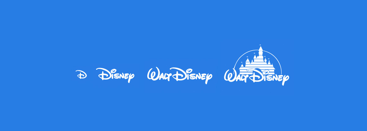
To put it simply, a Facebook profile picture is small. And because it’s small, you don’t have the luxury of a lot of space for a large, complicated logo that has lots of text and extraneous elements. As you design your Facebook logo, keep this small size in mind and opt for something compact. If there’s text in your logo design, make it large and clear so it appears easily on Facebook. This could mean playing around with different fonts to find one that’s legible at small sizes, like a bold print font instead of a thin cursive one. It could also mean creating another version of your logo that eliminates the text and/or reduces it to just one or two key elements. Read more about the 30 best fonts to design an awesome logo.
It’s also important to make sure your logo is legible on both computer and smartphone screens. Take a look at it in both sizes, and if it’s legible on computers but too small to make out on smartphones, revise it so it works for both. Being lazy with your logo design reflects poorly on your brand and can drive potential followers away, so be sure to make your logo look great on every screen people will view it on.
On Facebook, your profile picture isn’t the only place where you’ll want clear branding. Your cover photo is just as important as your profile picture and perhaps even more so, because it’s larger and when visitors look at your page, the very first thing they see. If you had to scale down your logo to make it fit your profile picture, your cover photo is the place for the full version. Use all your logo’s elements here and all the text you need – while you have to be efficient in your profile picture, you can go as bold and maximalist as you want (and as your brand persona allows) in your cover photo.

A Facebook cover photo is 820 pixels wide by 312 pixels tall on computer screens, and 640 pixels wide by 360 pixels tall on smartphones. Just like you tested your profile picture logo on both, test your cover photo on both kinds of screen to ensure everything looks right, that there’s no weird warping or stretching.
Adapting a logo vs. Starting New logo design
If you already have a logo, adapting it to Facebook can be easy. We say it can be easy, rather than saying it is easy, because it can be more complicated than you initially thought. Sometimes, creating a Facebook logo is as easy as taking your existing logo and scaling it down to fit your Facebook profile picture’s dimensions. Generally, there’s no scaling up or down necessary to make it work for your cover photo – you might have to give your logo an appropriately sized background to make it fit, but usually that’s simple.
That’s the best case scenario. In a less-than-ideal situation, you have to change your logo design somewhat to make it work for Facebook. This can mean redesigning it so it fits the size and scale of a profile picture, but sometimes, it involves more complex changes than that. It can mean redesigning your logo to give it a more minimalist look or omitting text that’s hard to read at small sizes. It can also mean you have to design an entirely new logo for your brand if your existing logo is too similar to the logo another brand is using on Facebook.
If you find yourself having to design a new logo, you’re facing a challenge: having to create a design that not only works for Facebook, but feels like it’s part of your brand. In this situation, revisit all the personality traits you assigned to your brand to reacquaint yourself with it. Ideally, your Facebook logo should feel like it’s just as much a part of your brand identity as the logos you use elsewhere – same color palette, same font if it includes text, similar imagery and the same overall look and feel. In fact, after you’ve designed your new Facebook logo, you might find it’s an even better representation of your brand and adapt it to be your brand’s new primary logo.

Creating a Brand for your Facebook Logo
Before you’re ready for a Facebook logo, you need a solid sense of your brand. Think of your brand as your company’s personality. It encompasses your company’s values, your company’s approach to business, the kinds of products you sell and the kinds of people you sell them to. For example, a company that sells auto parts primarily to middle aged and older men has a much different brand than a coffee shop that serves mostly young adult women.
How do you create a brand? By getting to know your company’s offerings and target audiences inside and out. Ask yourself:
• Who buys our products?
• Why do they buy our products?
• What industry are we in?
• Within our industry, which niches do we inhabit? Low, mid or high price compared to our competitors? Exclusive or widely accessible?
• What do our buyers expect from our brand?
• What are our brand’s core values?
• What are our company’s goals for the future?
• Where can buyers find our products? Big chain stores, smaller specialty stores, exclusively through our website?
• Who is our average buyer? Age range, gender, socioeconomic status, geographic location, values?
• What makes us different from other brands in our industry?
Once you have a clear image of who your brand is, you can design a brand identity that accurately reflects this persona. Having a clear brand identity is important because it signals to consumers what they can expect from your company and the unique value you provide. How can you express this identity visually? Through careful design choices in your logo and other assets like your website and social media profiles.
These design choices include:
• The color palette you use
• The fonts you use
• The kind of imagery you use
• The art style you choose: traditional, minimalist, modern, abstract, etc.
• Your copy’s voice
• The shapes you use in your graphics
You can also find out more about shapes in our article using shapes to design logos.
You can also find out more about shapes in our article using shapes to design logos.
No brand asset works harder than your logo when it comes to communicating who you are to the world. Your logo is the first thing most potential customers see, and it’s the most common image they’ll come to associate with your company. Because your logo is basically your brand’s face – and on Facebook, it goes where most users put photos of their faces – it needs to make your brand’s personality absolutely clear.
When you create your logo with a logo maker, the more design options you have, the better. The reason is obvious: when you have more design choices, you have more ways to express your brand. The more ways you have to express your brand, the more unique a logo you can create. That’s why we included a ton of font and image choices in Logogenie’s logo maker – it was designed to give business owners and content creators in every industry the creative freedom to design logos that truly work for them.

What NOT to do when you’re designing a logo for Facebook
When you’re designing a logo for Facebook, it’s just as important to familiarize yourself with what not to do as it is to familiarize yourself with what you should do. No matter what platform you’re designing for, it’s always in your best interest to follow general design best practices, like choosing colors that complement or contrast each other and composing your logo in a way that feels balanced, rather than awkward or chaotic. We suggest that you read our article about using the color wheel to find the perfect color combination.
But there are also a few logo design do’s and don’t’s that are specific to Facebook. As you create your Facebook logo, keep the following in mind:
Don’t Violate Facebook’s Content Rules
Facebook has fairly strict rules regarding the kinds of content you can and cannot post to the platform. This includes the content you use in your Facebook logo. Your logo cannot include:
• Nudity
• Sexually suggestive content
• Hate speech
• Extreme violence or gore
• Self-harm imagery
• Credible threats against specific individuals or groups
• Spam
Basically, overtly violent or graphic sexual content cannot be part of your Facebook logo. Similarly, you can’t make spammy text or hateful slogans your Facebook profile picture or your cover photo.
Don’t be a Careless Resizer
It’s very easy to take your full logo, scale it down, and plop it into your Facebook profile picture slot. But don’t do that. As we discussed above, scaling images up and down can stretch them, warp them or make them pixelated.
[image: logo that’s been warped or pixelated from being resized carelessly side-by-side with how that logo’s supposed to look]
Sometimes, resizing works. Often, whether it works or not is how large the image is to begin with and what kind of file it is. When you make a JPEG image file smaller, it can get distorted. If your file’s a PNG, it should be fine. But check it carefully and if your logo doesn’t work when it’s scaled down to Facebook profile size, recreate it at that smaller size so you know it will work.
Don’t be Generic
We don’t have to tell you everybody and their mother is on Facebook. With the millions of active Facebook profiles on the platform, there are millions of profile pictures. This is why you can’t afford to go with a generic Facebook logo. Having a generic-looking Facebook logo guarantees your page will be overlooked and ignored, which means fewer likes, fewer subscriptions and overall, less business for your brand.
But what if I don’t have a logo design yet?
If you don’t already have a logo design, you have an advantage over those who do. Why? Because you can create a completely fresh logo and develop it specifically for Facebook, rather than taking a logo that already exists and making it work within Facebook’s pixel limits.
You can design a brand new logo from scratch with Logogenie’s free logo maker. It’s very easy to use; there’s no design or coding skills required. Just like we discussed reacquainting yourself with your brand to create a Facebook logo when you can’t just resize your existing logo, you’ll need to flesh out your brand persona fully when you design a completely new logo. If you don’t yet have a clear brand identity, now is the time to create one.


