Every company needs a logo, what’s your logo worth if it isn’t clear in the eyes of your clients. As a designer I can tell you that a lot of people already have a lot of ideas floating in the back of their heads about how they want their logo to look before they’ve even started. Some people want their logo to look like something they’ve seen out in the streets. Some people have complete « out-of-the-box » ideas. Either way there are a number of logo design rules and guidelines that you have to respect if you want your logo to look professional. When it comes to online logo design, a lot of people get it wrong due to the fact that they are the ones designing the logo. Here are some crucial guidelines that will help you design a very professional logo:
Start designing your logo now
Complexity
Keep it simple. Simple logo are easier to look at and remember. The simpler your logo is the easier you’ll be able to adapt your logo to different formats (websites, business cards, stickers, T-shirts, billboards) and the more people will be able to memorize it. Here’s an example of a logo that has too much complexity to it :

Notice how you get hit right in the nose by the super flashy yellow? This color is much to overcoming, the color is basically the only thing that stands out and it’s hard to look at. Apart from being much too flashy, you have to keep in mind that your colors should be print friendly. This color will not turn out well if printed. The frame around the text is very chunky and isn’t necessary. The yellow in the text makes it hard to read and the decorative stars are tacky and unnecessary. Avoid using too much decorative gizmos and shapes around your logo and just keep it clear and simple. Use complementary colors that aren’t too flashy and make sure that they’re not too bright otherwise you’ll have problems when printing.
Fonts
Make sure that the font you are using is easily readable and not too weird. Avoid using caligraphic fonts that are too complicated, favour instead sharp, bold fonts that stand out and that will be readable from close up and far away. If you are using two font types, make sure they go together (just like I mentioned with the colors above). You shouldn’t use more then two fonts in your logo composition, using too many fonts makes your logo look scrappy and unprofessional. Here’s an example of a logo that has not utilised fonts properly :
In this example the fonts and colors clearly do NOT go together well. The designer has used a caligraphic font for the company name that isn’t very readable, the baseline underneith uses a futuristic, square font that doesn’t blend well with the caligraphic one and after that well… you have to keep in mind that you’re not designing a business card when you’re making a logo, adding your address, number, date ect… isn’t recommended. A professional looking logo should only be composed of 2 or 3 lines at the most and the fonts have to blend in well together along with the colors. Keep in mind that people have to be able to read the text from close up and far away. If you print the example above on business care, it goes without saying that the text will NOT be easy to read… Don’t make you’re clients get their magnifying glasses out. Use the same kind of font families and keep the texts as short and clear as possible. This is a crucial part to designing a successful logo !
Structure
It is super important that your logo remains well structured. The alignment of the elements inside your logo is very important. Having a logo that isn’t structured and aligned properly can seem unprofessional and end up not even looking like a logo. Observe the example below and make sure that you don’t make the same mistakes :

In the first example (as discussed above) there is way too much texts, fonts variations and sizes. Keep it simple, make sure that you’ve only got 2 or 3 lines of texts in your logo max. In the example number two, we have colors that are too flashy, text and icon overlaping, alignment problems and incoherent font selection. Avoid overlaping elements as this creates confusion, make sure the elements are spaced out properly and that they are aligned nicely. Here are a few examples of logos that are very well structured and that work !

Notice that in the first example that the icon is nice and visible and perfectly aligned with the texts. The two colors used in the texts are the same as the colours in the icon and the size/ quantity is not too overcoming. Number stands out, you see directly what this company deals with. The baseline is pretty much the same length as the company name giving the whole design more structure, the colours go good together. Number 3 is sweet and subtle. Roof icon on top of the company name, bold texts, easily readable fonts and with the same colour as the icon, the baseline is perfectly aligned with the company name and has some letterspacing which gives it a little more style.
Colors
Colors are one of the key elements in a logo that will determine wether or not your logo will work. Colours that are too bright will not look good but most importantly they will not come out good on printed products. Make sure that you use complimentary colors, here’s a nice color palette with warm and cool complementary color variations :
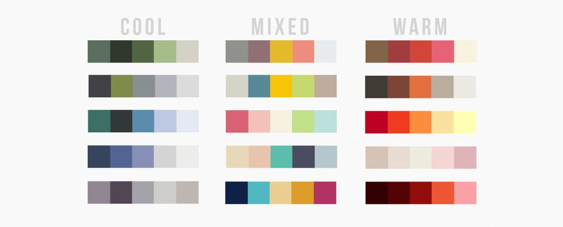
Make sure that all elements work in harmony with the colors. Colors from the icon should be used for the texts. Light to medium greys are also cool because the go with everything.
Closing remarques
In conclusion to this article, I’d have to say that when you’re making a logo, you have to put some real thought into it and also do your homework. Have a look at what other companies are making and avoid making common mistakes. Make sure that the colours selected match your industry, for example you shouldn’t choose a bright yellow if your doing healthy meal delivery. Make sure your logo is perfectly aligned. Insure that you are using easy to look at fonts that stand out and that are easy to read from close up and far away. And last but not least, KEEP IT SIMPLE. The simpler the better. The simpler your logo is the more your clients are going to remember your company name the more they are going to think of you when they need your services.
We hope this article has helped you in understanding the does and dont’s when designing a logo. Our site provides a do-it-yourself online logo design service which has been designed and elaborated by our experienced and passionate team. Design your logo for you company today in under 15 minutes, choose from over 1000 premium logo templates hand crafted by our team of designers and customize your logo by using our easy-to-use online tools.
Start designing your logo now