When you’re looking for the right font for your logo, the sheer volume of choices you’re confronted with can be overwhelming. The quickest way to cut that volume down and find the perfect font is to go into the search with a clear idea of which kind of font meshes best with your brand.
Choosing the Right Font for your Logo
The right font for your logo isn’t a question of personal preference. Your logo needs to match your brand. Fortunately, finding the right font for your brand is more math than art, and here are the formulas you’ll need to work it out:
formal and sophisticated = serif font
casual = sans serif font
bold and action-oriented = bold font
homegrown and organic = handwriting-inspired font
modern and cutting edge = futuristic font
quirky and fun = creative font
So before you can choose a font, you need a crystal clear understanding of your brand. Are you an in-your-face startup posed to upend your entire industry, or an old-school service provider who prides themselves on maintaining good old-fashioned values? If you need help figuring out your brand and how a font works into your branding, check out our article on the different font families.
The Logogenie logo maker includes 70 fonts to choose from. These fonts are split up into six categories: rounded, creative, elegant, futuristic, bold and XXL. Within each of these categories, you’ll see we’ve assembled a variety of fonts to give you plenty of unique options. For example, you might want an elegant font for your beauty brand and need a serif font to communicate that your brand is a little more exclusive, a little more sophisticated than the others on the shelf. We’ve got elegant fonts of both the serif and sans serif variety.
Take a look at five examples of our diverse fonts from each of our six categories.
Rounded
Rounded fonts, like rounded shapes, are a great choice for any brand that has an approachable, engaging feel. There are lots of ways a font can do rounded, like:
Klasik
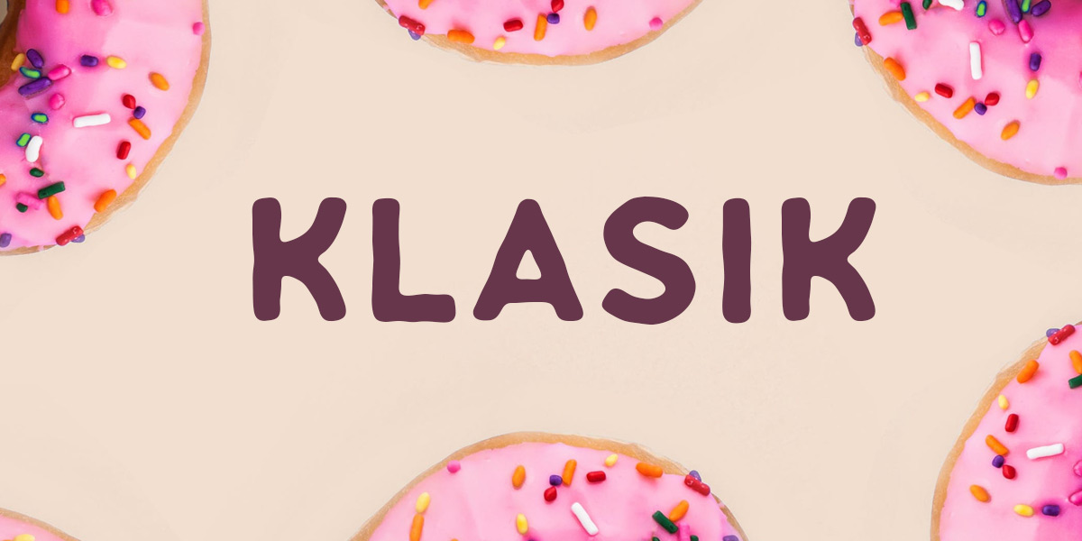
Klasik is an all-caps, unconventional take on rounded fonts. One of the things about Klasik that makes it stand out is that the edges of the letters aren’t perfect straight lines; they have a hand-shaped, malleable quality that makes them look like they’ve been sculpted with dough. This makes it a perfect font for bakers, sculptors and any company that brands itself as handcrafted.
Fontastique
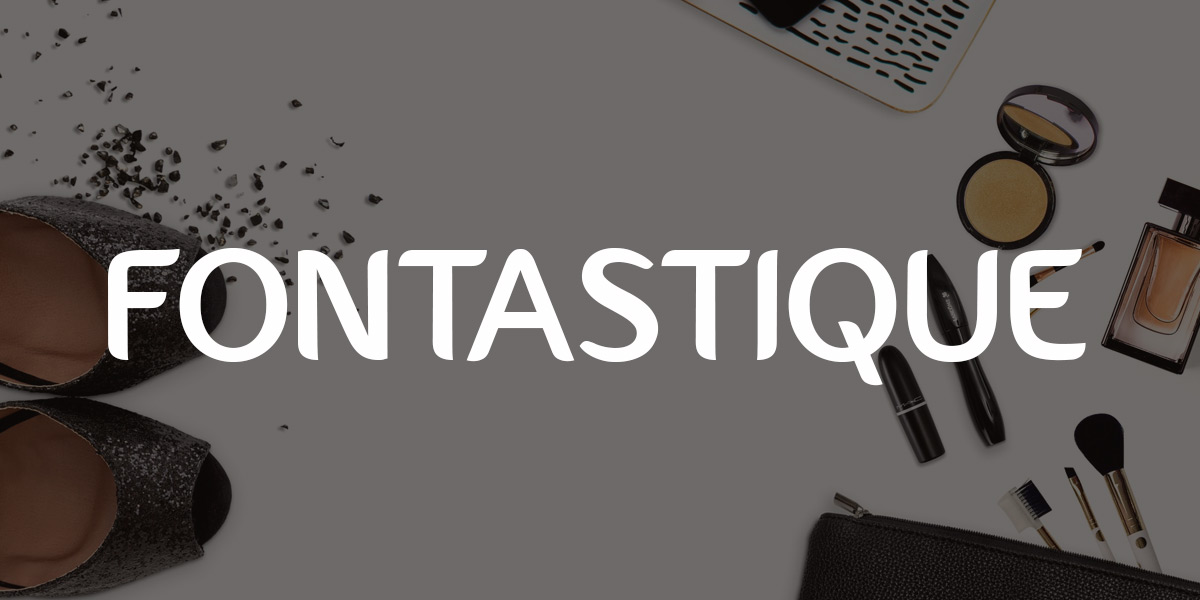
Fontastique goes beyond what we typically expect in a sans serif font by turning portions of its letters into almost-complete circles. For an example, take a look at its lowercase D. As a curvy font with very few hard angles, Fontastique has a soft, feminine feel that makes it perfect for any women’s apparel or beauty brand.
Orborn

Much like a few other rounded fonts, Orborn turns certain letters (like its lowercase A) into perfect circles. One of the cool things Orborn does is turn some of its capital letters into larger versions of lowercase letters, which only adds to the friendliness factor and makes it a great choice for any brand that aims to feel like the life of the party.
Maxwell
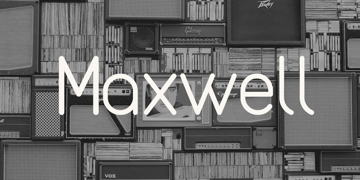
Maxwell is a font that’s got straight lines, rounded edges and a few quirks. Take a look at its capital H and the height of its lowercase I. It’s a font that looks clean and conventional at first glance, but once you spend a little more time with it, its personality shines through. Maxwell’s a great choice for a brand with a similar persona: clean-cut, but with a funky undercurrent.
Aquatico

As its name implies, Aquatico has an aquatic feel. Take a look at its capital A to see the shape of a cresting wave in the middle line. That’s not the only spot where this rounded font feels open and free like the ocean. Certain capital letters, like K and R, have detached sections (take a look in our logo maker to see what we mean) that give it a cool, casual open-air feel.
Creative
As you can probably imagine, our collection of creative fonts is our most varied. These are the fonts for brands that don’t fit into conventional boxes.
Inzomniak
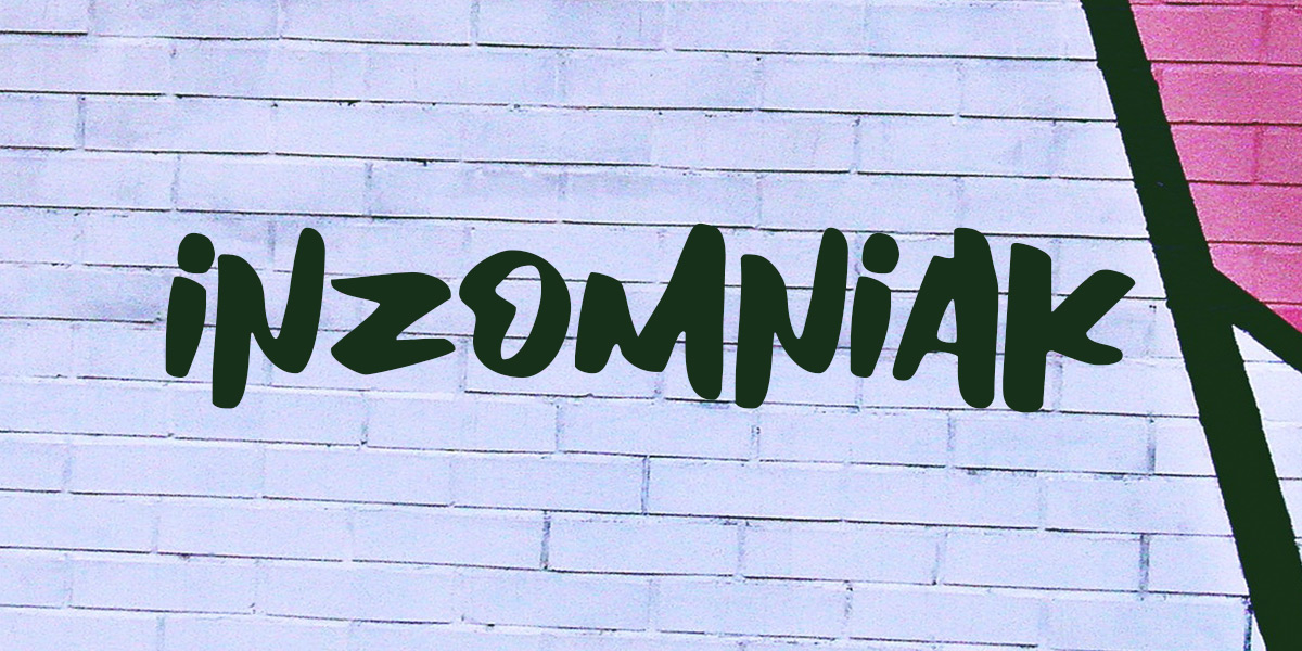
Inzomniak font makes any text look like it was scribbled with a chisel tip marker. If you want your text to look like graffiti, Inzomniak is a great choice. It’s angular, it’s edgy, the letters aren’t all the same size and the strokes aren’t even. And that’s why it works. It’s not polished and it doesn’t try to be, which makes it the perfect choice for any brand that can say the same about itself.
Shintia script
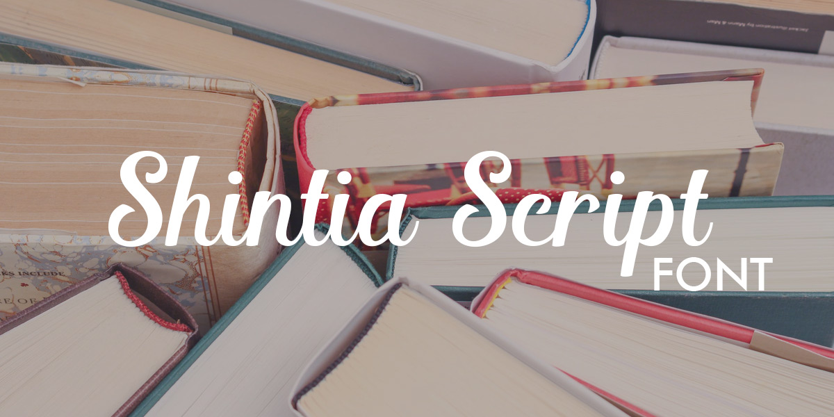
Shintia script contrasts with Inzomniak in a lot of ways. It’s neat, its letters feel balanced and overall, it’s cute. The oversize capital letters and long, hanging serifs give it a whimsical, handwritten feel that makes it appropriate for any brand that considers itself whimsical or twee.
Wonderful
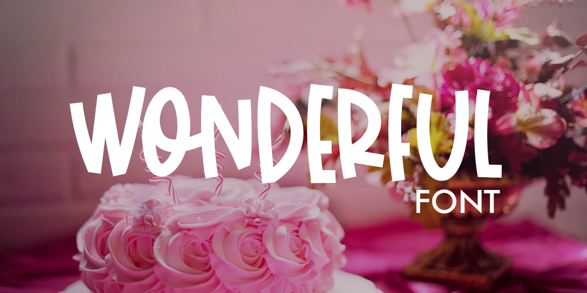
Wonderful is a wonderfully goofy, fun font. That’s why it’s an obvious choice for any brand meant for kids or kids at heart. No serifs here; just bendy, bouncy, uneven letters that feel like they’re urging you to get on the trampoline with them and have a great time.
Selina
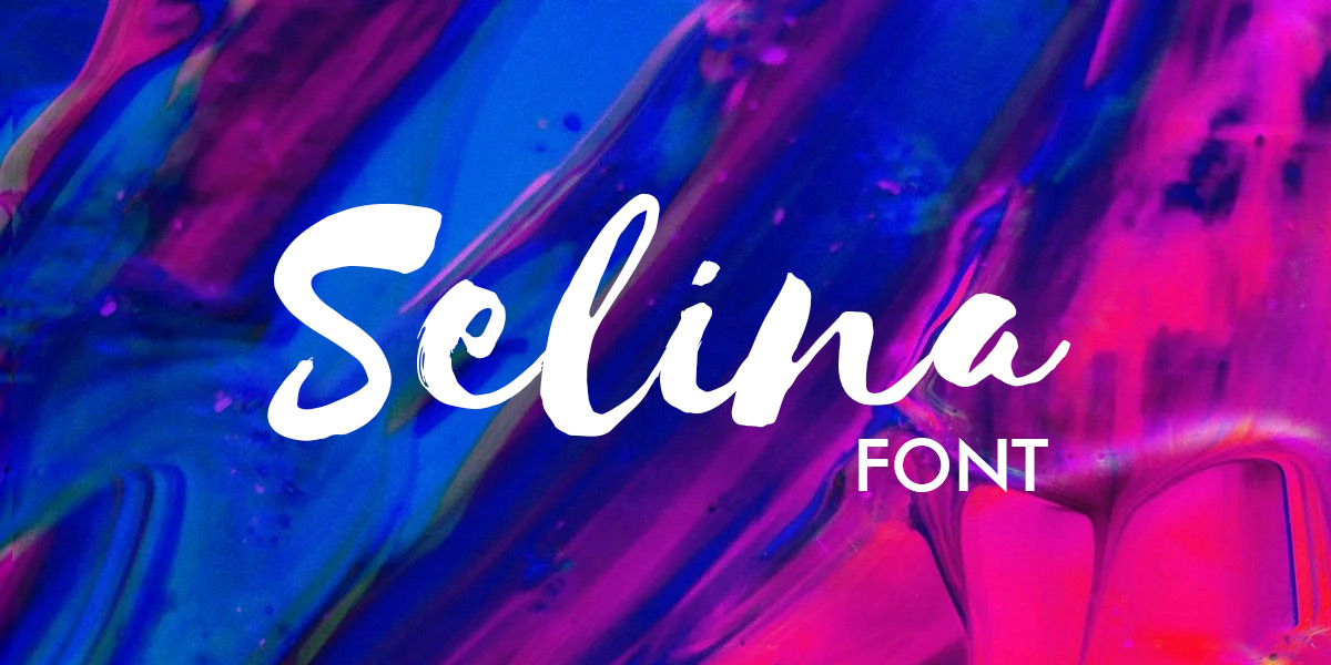
Selina is another font that looks like handwriting, but like every other font in our creative section, it’s got a feel all its own. Selina looks like it was written by a quick hand with a felt tip pen, a hand with heavy downstrokes and lighter, energy-filled upstrokes. This font feels casual, yet artful.
Artypa Bold
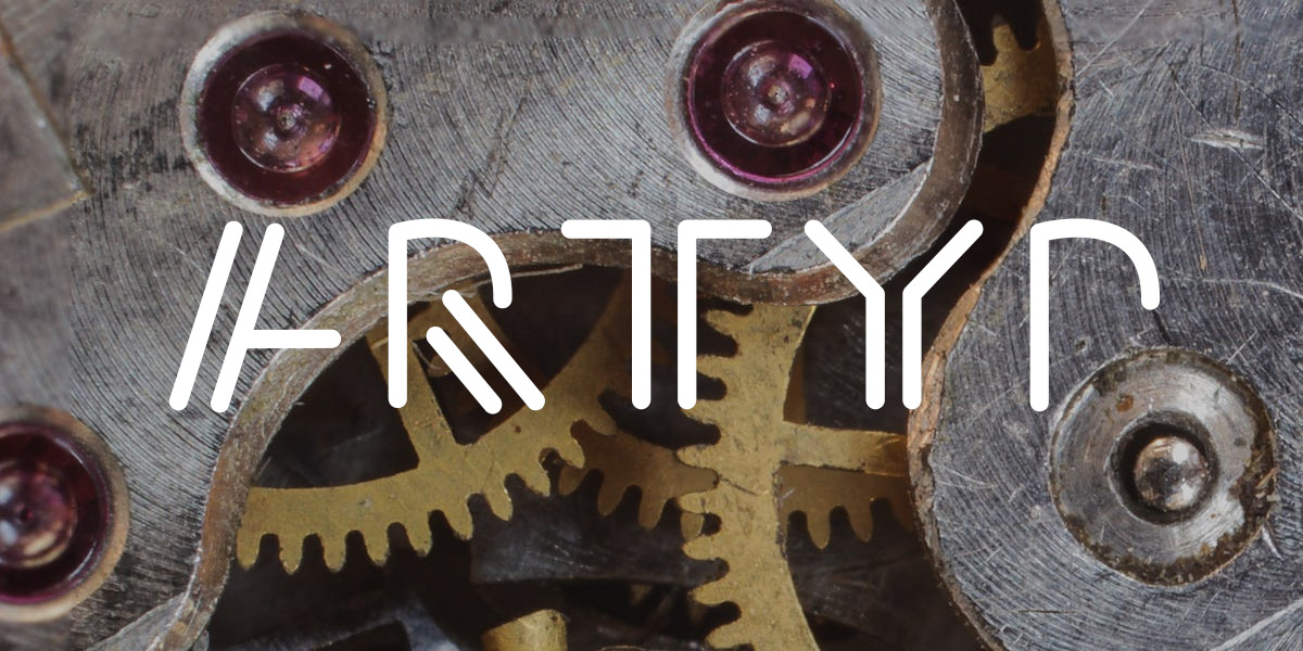
The last of our picks for the creative section, Artypa Bold, is the font a robot would use to sign his name. Blocks and solid lines set next to each other, rather than intersecting with each other, give this font a modern, machine-produced feel. While it feels ultra-modern, its shapes also feel a bit like hieroglyphics, which only adds to the otherworldly feel.
Elegant
Elegant fonts are for brands that are, well, elegant. But there are lots of unique ways to be elegant, and as these fonts show, lots of unique ways to communicate it:
Agne
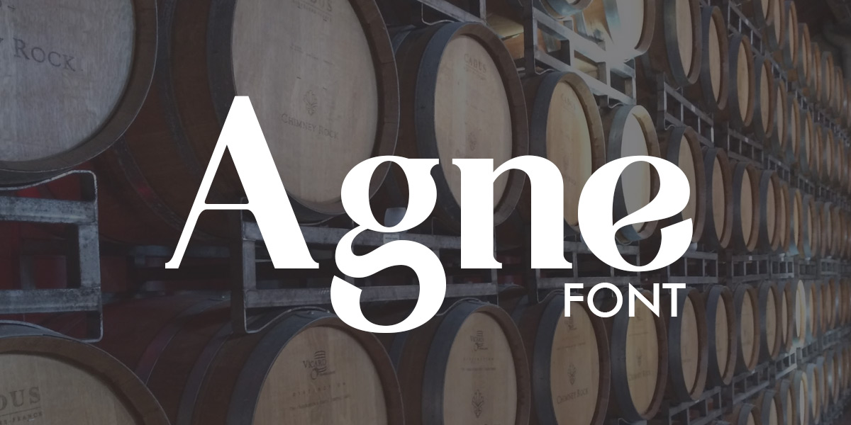
Agne is one of the heavier fonts in our Elegant category, but it’s not pure brawn. Its letters are balanced, with delicate lines contrasting thicker ones. Serifs cap and complete each letter in Agne, giving it a high-class, luxurious feel that’s perfect for a couture boutique or an exclusive wine label.
Justus
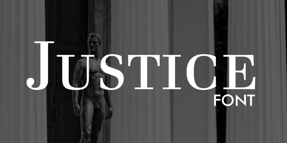
Justus looks similar to Agne, but it’s lighter and more agile-feeling. Its contrasts between heavy and light lines are also more pronounced, with wide capital letters and long, overhanging serifs. There actually aren’t any lowercase letters in Justus; its lowercase letters are simply shorter versions of its capital letters.
Casual
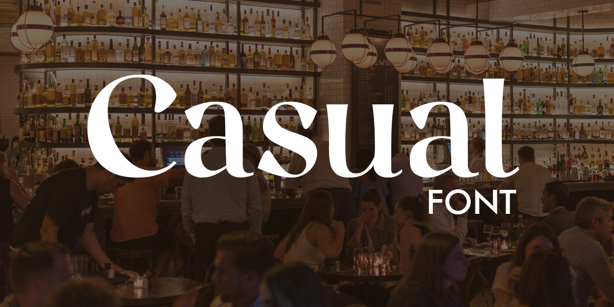
You wouldn’t expect to find a font called Casual in our Elegant section, would you? But Elegant is exactly where this font and its understated elegance fits. With its lack of serifs, Casual doesn’t immediately read as a luxury font, which makes it perfect for a restaurant that’s classy, but not
Warnock
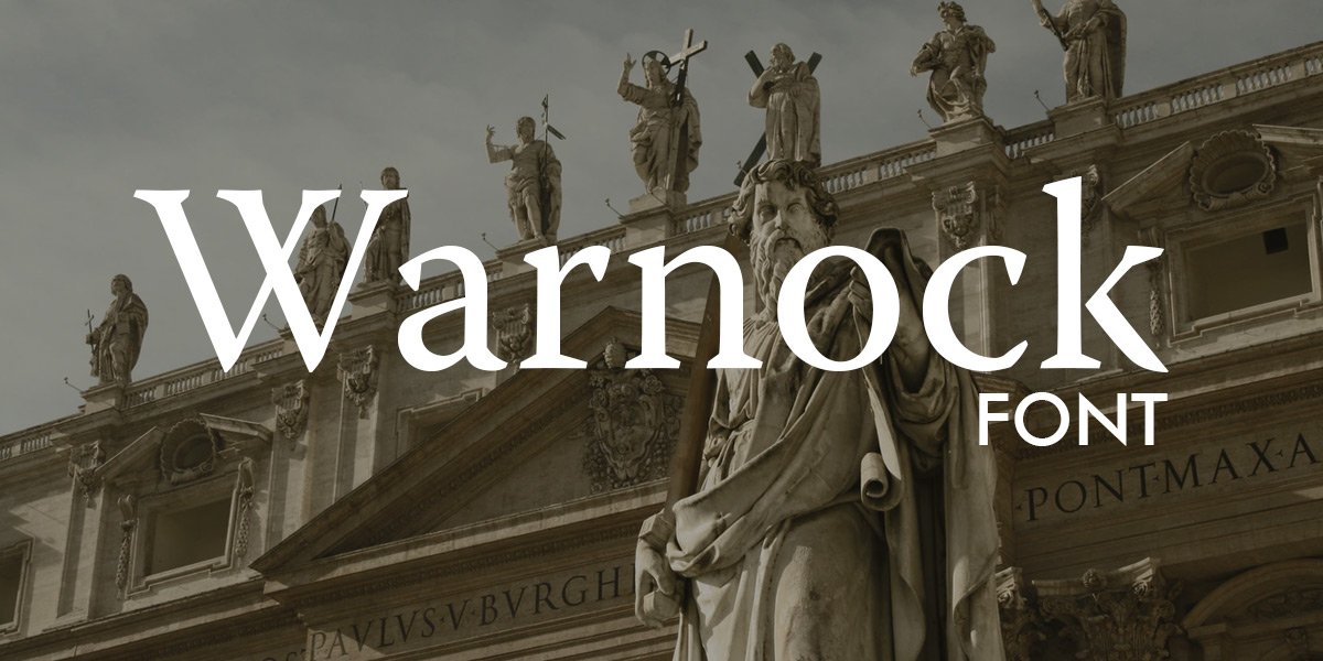
As a font, Warnock manages to be two things at once: elegant and edgy. Its tall, serif-topped letters give it an aura of poise, but the diamond-shaped dot above its lowercase I and the jaggedness of the serifs on its capital L and lowercase S give it a somewhat subversive look.
Copperplate
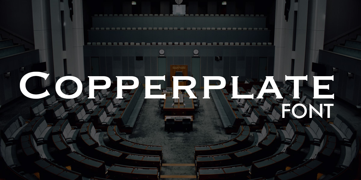
When you need a traditionally elegant logo, go for Copperplate. Copperplate has all the elements that make a font feel polished: uniform letters, clear angles and of course, serifs.
Futuristic
Futuristic fonts are for forward-thinking brands. Say that five times fast and you’ll be...still exactly where you are right now. But if your brand is all about living for tomorrow, make one of these fonts the focal point of your logo:
Blanka
If aliens has a font, it’d be Blanka. With lines that fit together like puzzle pieces, Blanka is part futuristic font, part cipher.
Bioweapon
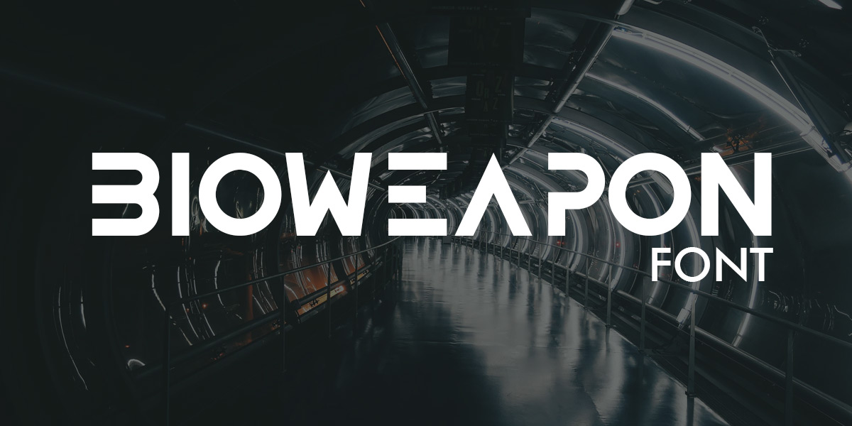
Simple, blocky and angular, Bioweapon is the font of choice for a tech brand or any other brand that needs a sleek-looking logo. What makes Bioweapon stand out is what’s omitted – key lines in certain letters, like its capital D and capital E, that give it a clean, minimalist look.
Space
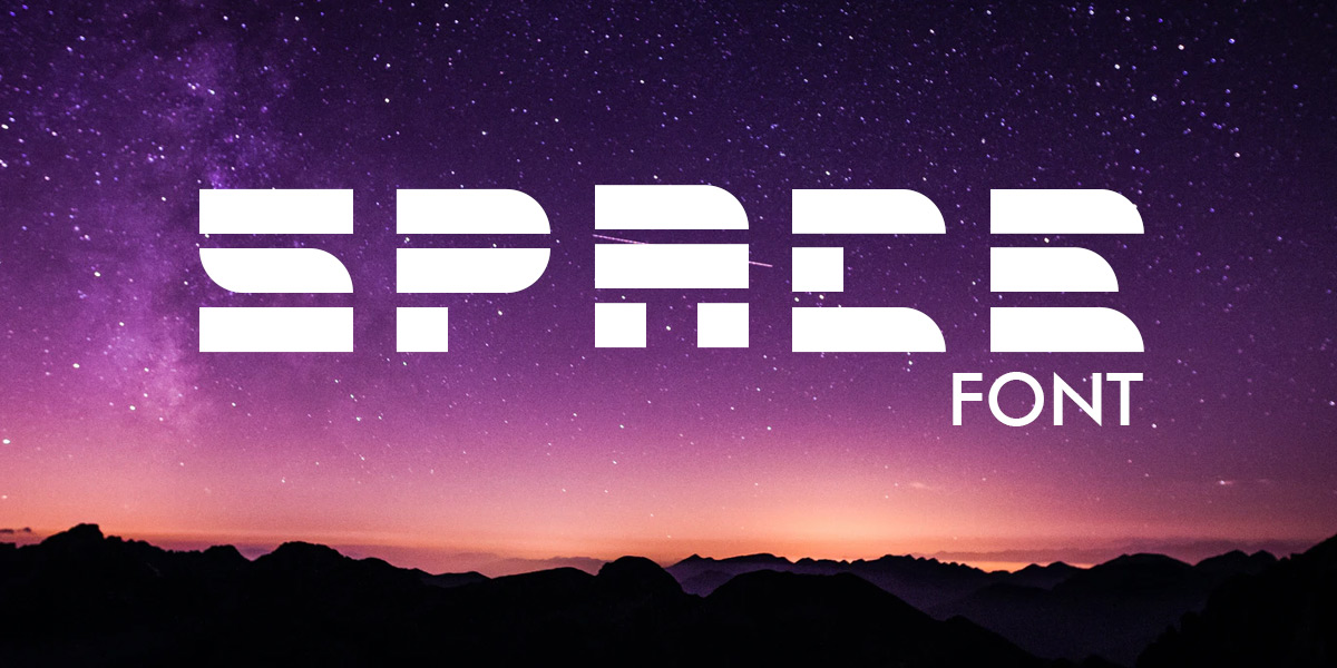
Space. The final frontier. The backdrop of tomorrow. When you use the Space font, you tell the world you’re a modern brand...in a throwback sort of way. Space looks a lot like IBM’s logo, which has a nostalgic, old-school feel. And although it might sound contradictory, an old-school space font actually fills an important niche. If you’re a retro arcade or a quirky geek nostalgia brand, Space is the font for you.
Walkway Black
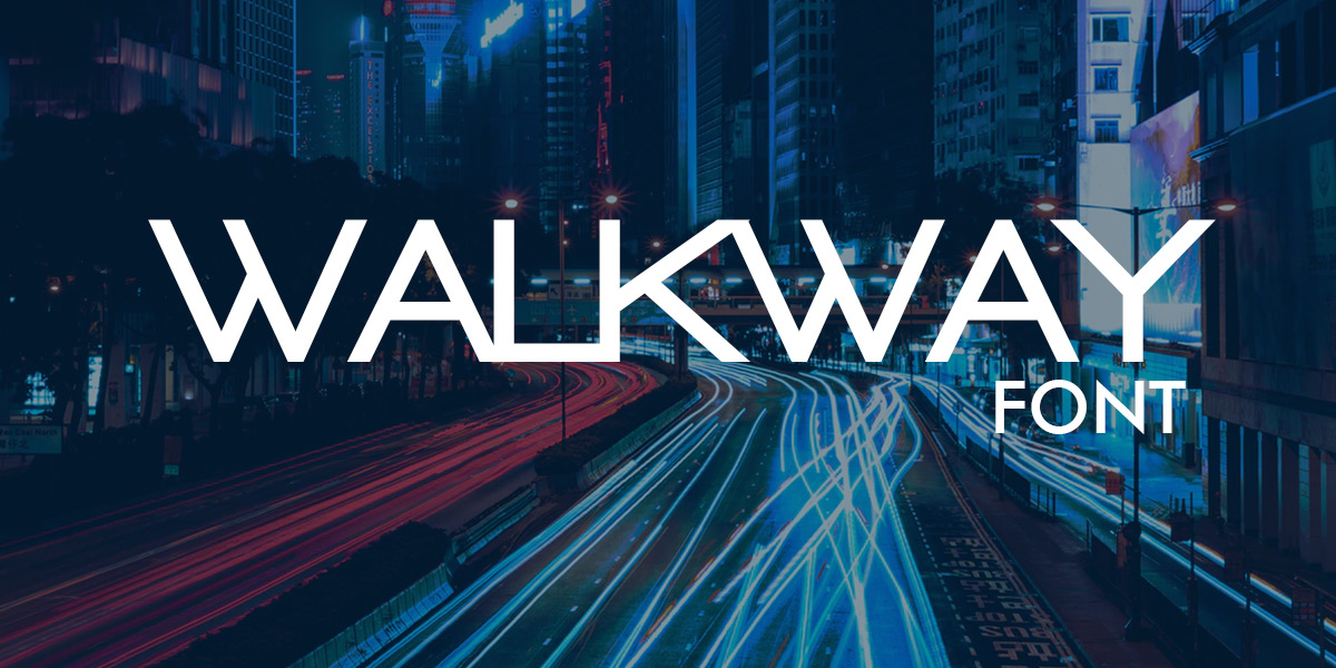
Walkway Black isn’t as overtly futuristic as the other fonts in our list, but it definitely reads as modern. And if you’re a brand that’s modern, but not sci-fi or space age, Walkway Black is an ideal way to walk that line between forward-thinking and lightyears in the future.
Quantum
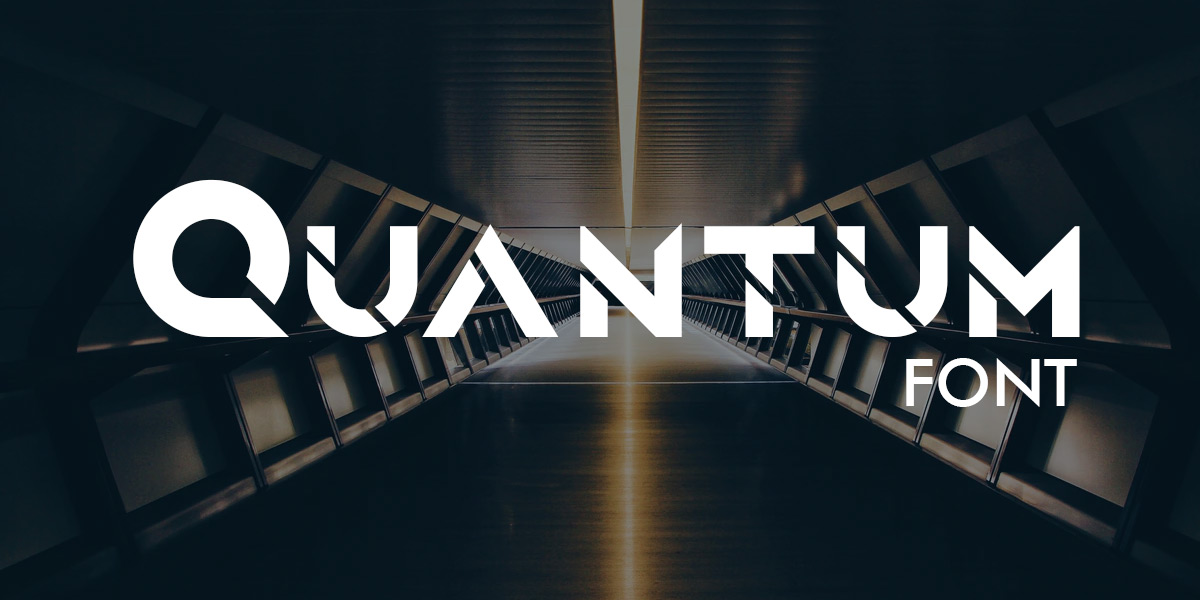
It doesn’t get more futuristic-feeling than a font named Quantum, does it? Quantum’s razor-sharp diagonal lines cut through its thick, angular letters, making them feel like some otherworldly metal sliced by a lightsaber.
Bold
When you’ve got something important to say, say it boldly. Our collection of bold fonts are not for the faint of heart; they’re for saying what you mean and meaning exactly what you say.
Cornerstone
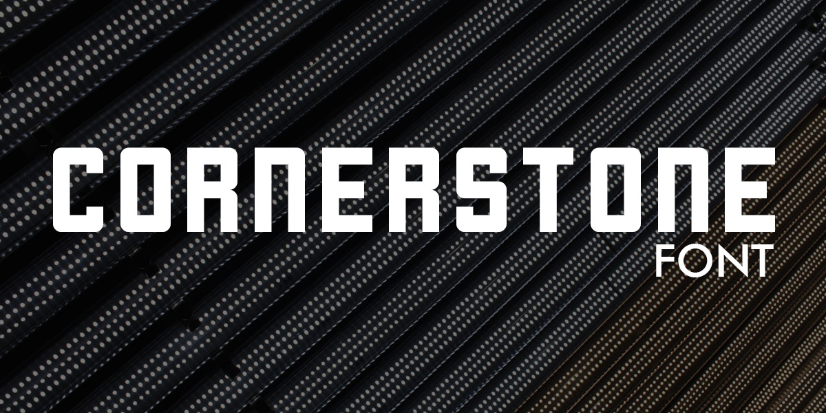
Cornerstone has a modern, almost digital look. And that makes it perfect for a brand that’s techy in any way, whether its an electronics retailer or an IT provider. With tall, uniform letters and no serifs, Cornerstone is an unpretentious choice for a brand that simply gets the job done.
Zwodrei
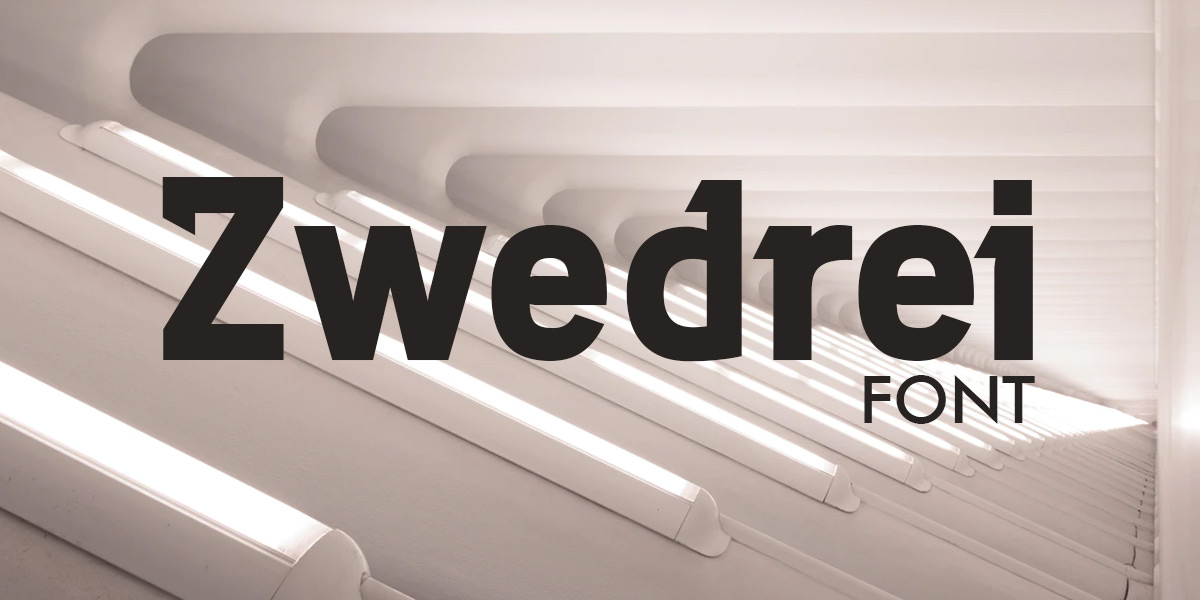
Zwodrei makes a bold statement – with a little bit of flare. The sharp, tooth-like serifs on this font make it feel daring without being over the top.
Vieira
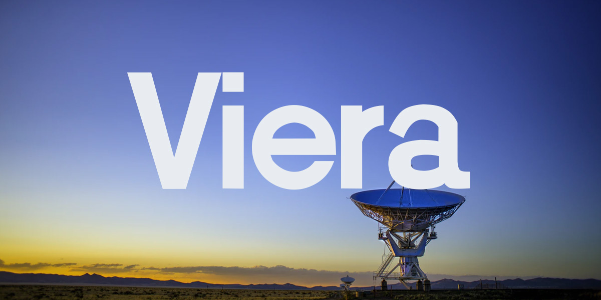
Vieira’s boldness comes from its letters’ width. There’s no denying it, this one font that takes up space. No need for serifs, Vieira makes its message clear with squared edges and an even weight distribution throughout.
Mabella
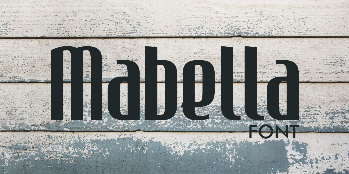
Mabella’s uniform, close-together letters kind of look like a picket fence, which makes it a great, subtle font choice for a fencing company or really, any brand in the construction industry. Its thick letters make it feel sturdy and strong, like you’d want the fence around your property to be.
Freeroad
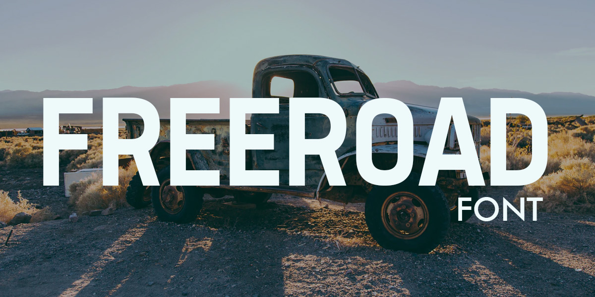
Freeroad doesn’t leave much room for empty space – within its letters. Take a look at its lowercase I, the dot hovers over its staff ever so slightly. Next, take a look at its lowercase A, with its tiny circle of negative space. But between letters, Freeroad’s got miles of space. This font’s a great choice for any brand that has a large presence and fills up every inch of that presence.
XXL
A big brand needs an XXL font. So what’s a “big” brand? We don’t necessarily mean the Amazons and Disneys of the world, we mean brands with a big presence. Brands that use their outside voices, brands that are their industries’ heavy-hitters. These brands need fonts that can get the job done, like:
Debussy
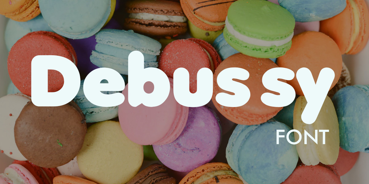
XXL can be soft, too, and that’s the precise niche Debussy fills. It’s large, yet approachable like a big friendly great dane. The rounded letters and lack of serifs make Debussy feel friendly, while the font’s weight makes it impossible to ignore, making any text displayed using it a solid anchor for all other elements in the logo.
Explora
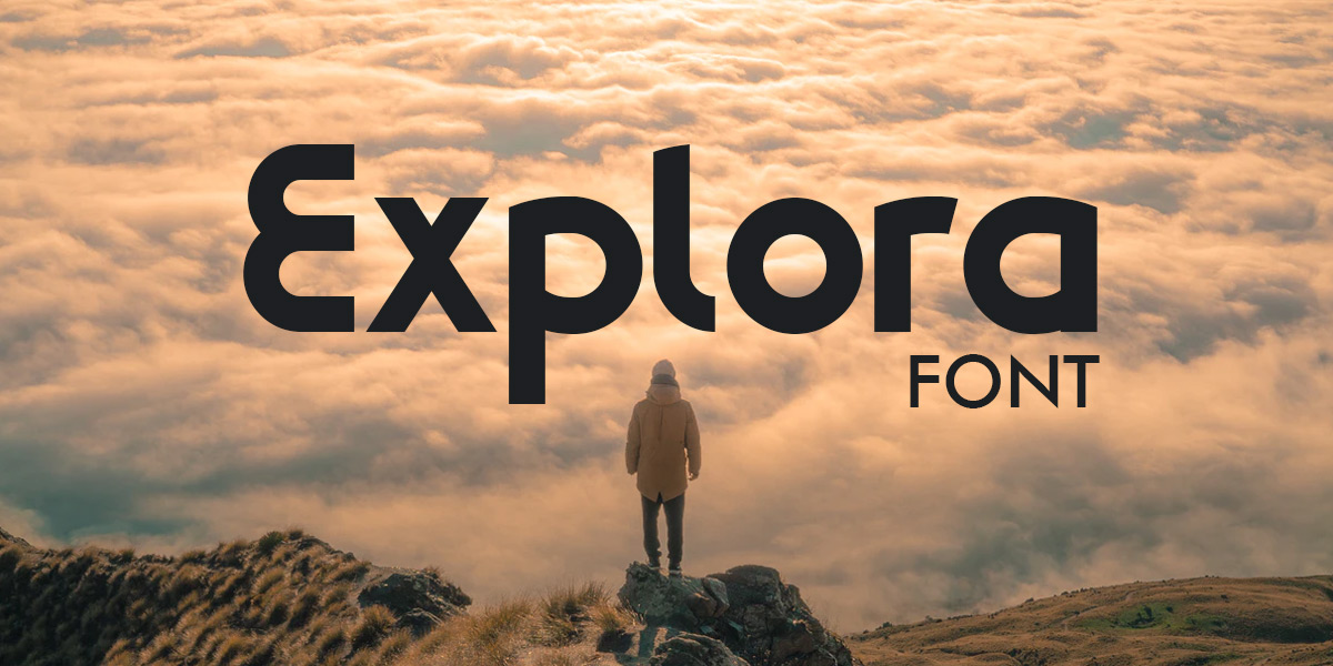
Explora is a streamlined, slick-looking font that would feel at home on the side of any law firm or accountant’s building. The letters are round, but not completely round – inviting, but not without boundaries.
Futura Xblk BT
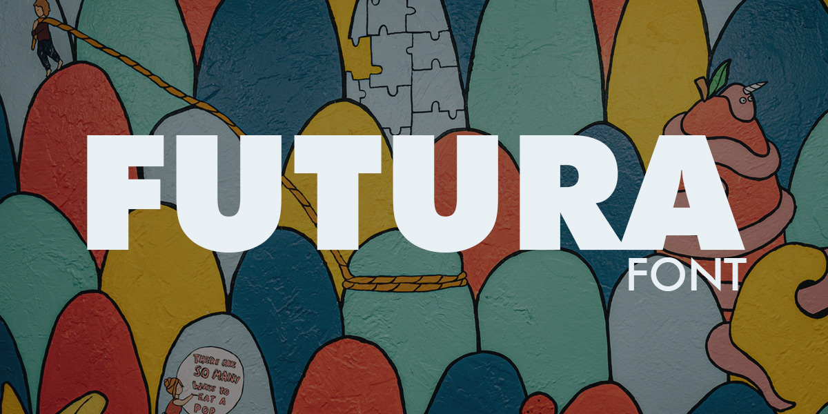
When you want this biggest, heaviest font Logogenie has to offer, Future Xblk BT is it. This is the bulky econofont you need when you need something thick and solid. It’s a great choice for a mason or any other kind of stoneworker, because it communicates exactly what the client can expect: a solid job made with heavy material.
Gotham Black
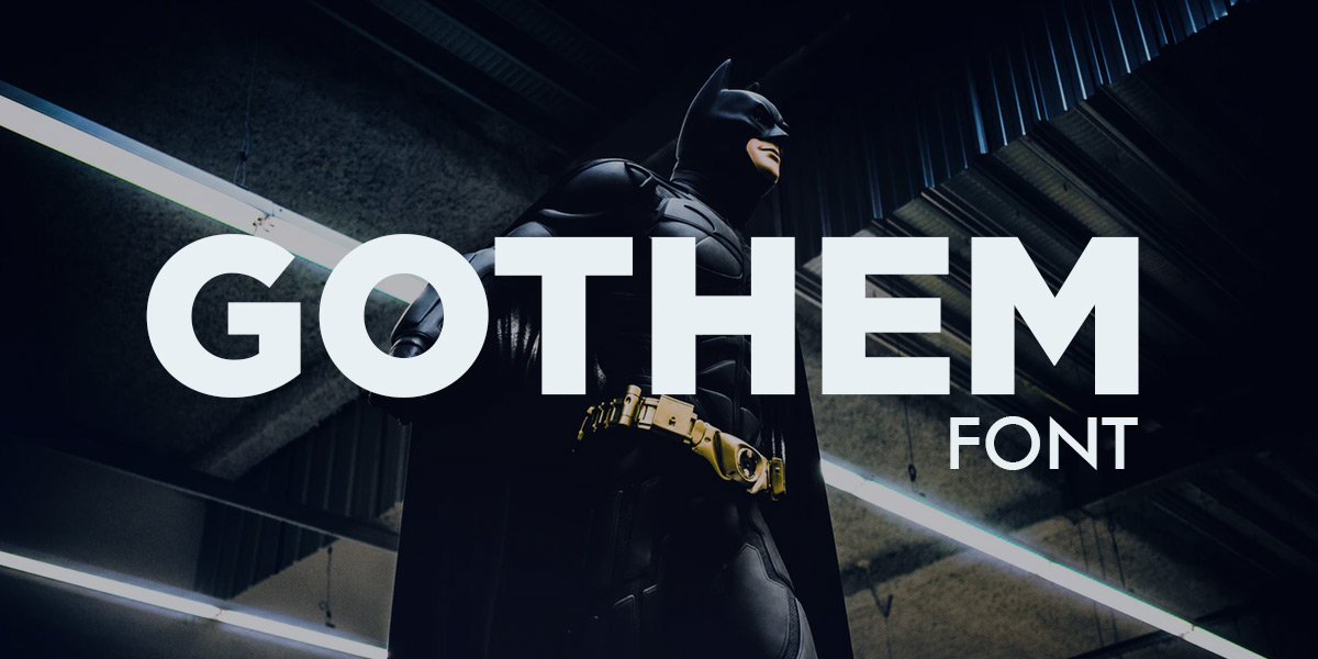
At first glance, Gotham Black looks like a pretty simple font. And in a lot of ways, it is. And for many brands, a simple font is the best font because it doesn’t distract from other elements in their logos. Gotham Black is a bold sans serif font with perfectly symmetrical letters. When you need a font that makes a subtle statement while taking a backseat to other elements in your logo, go with Gotham Black.
Cunia
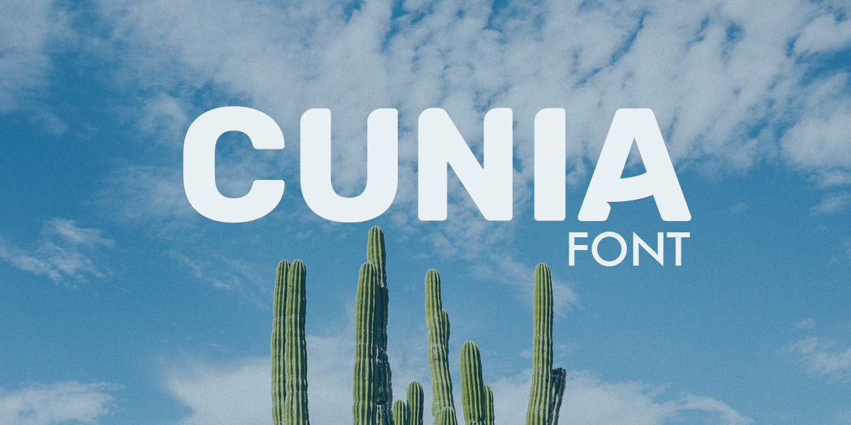
Cunia’s all-caps makes it stand out from other other XXL fonts in our list. Despite being in all caps, text written in Cunia doesn’t feel like it’s being shouted. The subtle middle strokes in letters like A and H and the rounded top left corners of letters softens Cunia somewhat, giving it a modern feel.
Still looking for the perfect font? Then check out this article about the 50 Best Fonts for Logos in 2020
Test Out As Many Different Fonts as You’d Like
You’ll probably find at least two fonts that fit your brand...and probably more. If you’re stuck between a few different logos for your font, Logogenie’s logo maker makes it easy to compare them side-by-side to see how they look with your logo. Under the Texts tab, click add new text. This will add another line of text to your logo. You can then change the font for each piece of text separately and see how two different fonts – and other options like different colors, different sizes and different levels of letter spacing – look with your logo.
Check our logo maker out now to get started on your brand-perfect logo. No graphic design or coding experience required; we’ve got everything you need to create a great-looking logo included in our easy-to-use editor. Don’t wait to get started – create a new, ready-to-use logo today.


