So by now, you know your logo needs to have an eye-catching, on-brand color palette if you want it to connect with your ideal audience. And in other articles we’ve published, we’ve talked about
what different colors communicate when they’re used in logos and shown you different ways to combine colors in your logo to create engaging visuals.
But there’s more to choosing a color palette that works than just matching your brand’s traits to colors and calling it a day. If you do that, you might end up with a...questionable color palette. So how can you create a color palette for your logo that communicates who you are as a brand and looks appealing to your audience?
By understanding the science behind what makes certain
color combinations look good. Just like chords, groups of notes with specific intervals between them, sound pleasing to our ears, color groupings based on specific positions on the color wheel look pleasing to our eyes. And just like those pleasing chords are called harmonies, visually pleasing groups of colors are known as color harmonies.
Understanding the Color Wheel
The color wheel is a chart that shows the relationships between colors. The concept dates back to 1666, when Sir Issac Newton identified the spectrum of six colors he saw when he passed white light through a prism. Later, the relationships between these colors and each color’s psychological effects were studied and understood further, creating the field of color theory.
Color theory is the set of guidelines that artists and designers use to make color choices that achieve specific goals while being aesthetically pleasing to viewers. Within color theory, the color wheel is the most prominent guideline; the graphical representation of all color relationships.
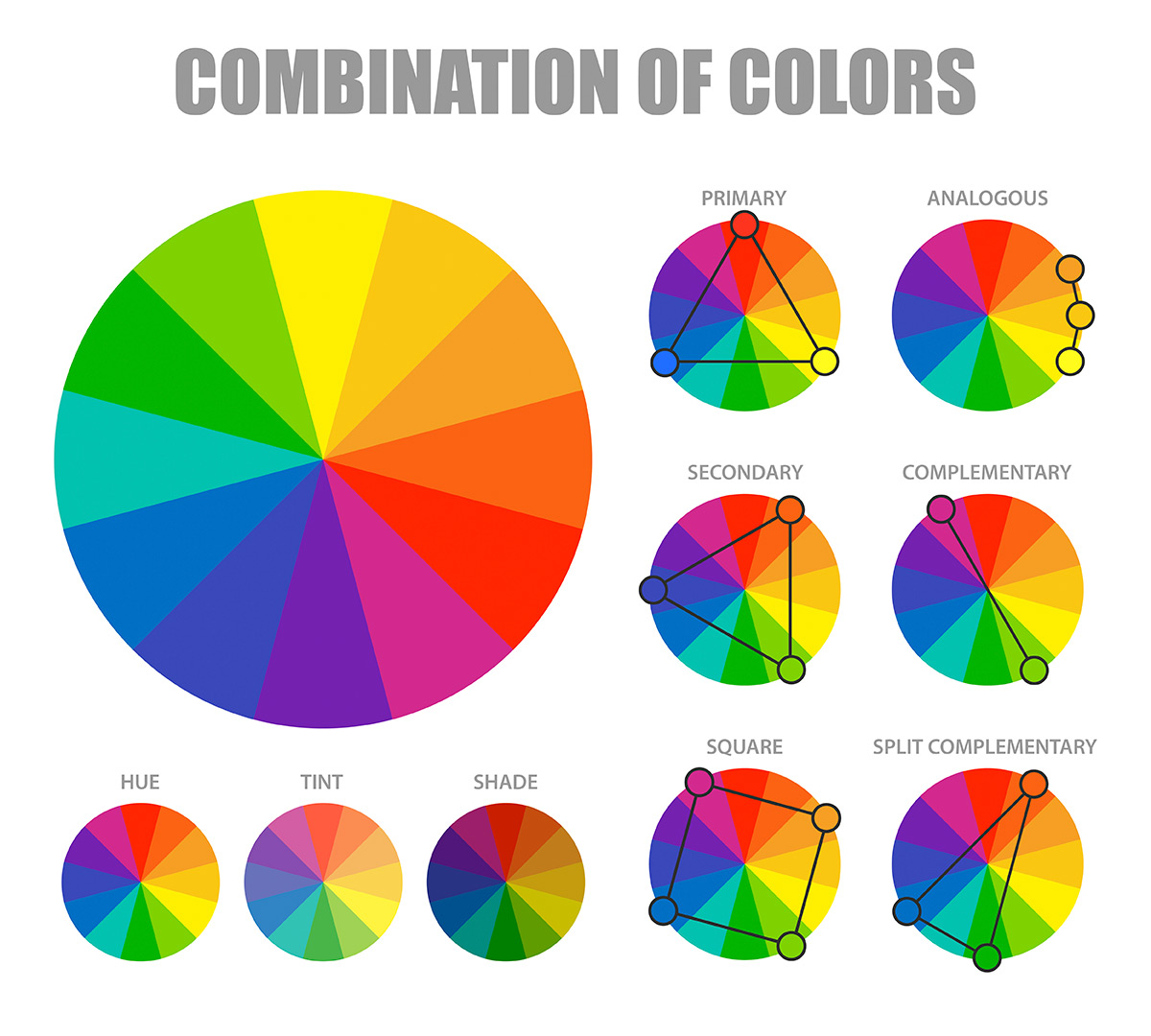
On the color wheel, colors – also known as hues – are divided into three main categories:
Primary colors
Red, blue and yellow are the three primary colors. These are the colors that cannot be created by blending other colors. Instead, all other colors are created by blending some combination of them.
Secondary colors
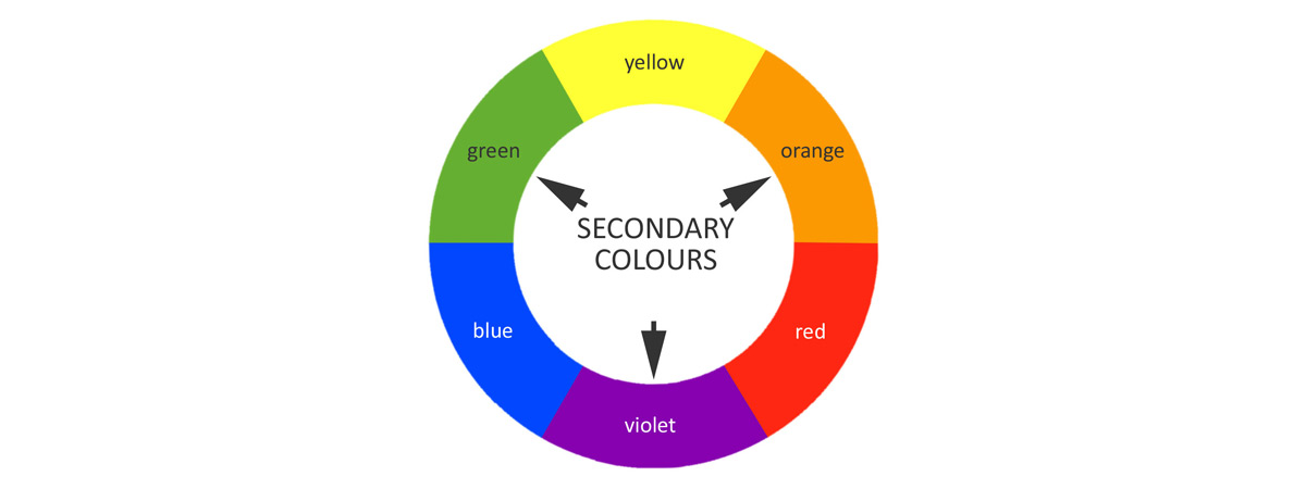
Orange, green and purple are the three secondary colors. These are the colors that are created by blending combinations of the primary colors, like blue + yellow = green.
Tertiary colors
Tertiary colors are the colors that exist between primary and secondary colors. For example, orange-red is the hue that exists between orange and red. These colors are created by blending two adjacent colors, like blending yellow and green to create yellow-green. The only way to create a tertiary color is to blend a primary and secondary color that sit right beside each other on the color wheel; it’s not possible to create yellow-blue or orange-purple.
But that’s not all you need to know about the color wheel. There’s also shades, tints and tones.
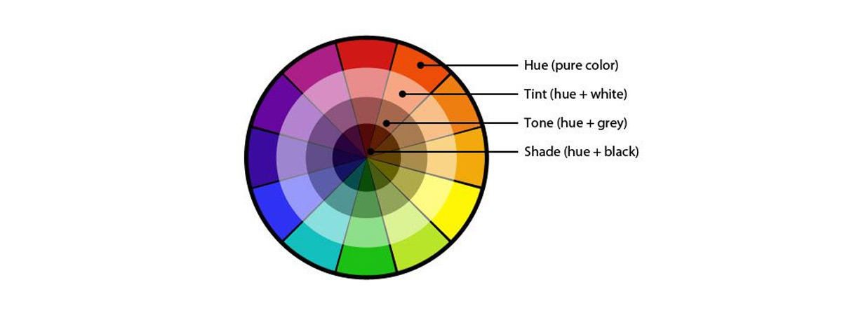
A shade is created by adding black to a color. It creates a darker, richer version of that color.
A tint is the opposite of a shade. It’s a lighter version of a color created by blending the base color with white.
A tone is a washed-out, neutralized version of a color created by blending it with gray. Often, tones are used to create a pastel look.
Using different shades, tints and tones in your logo’s color palette can add levels of complexity you wouldn’t be able to get by just using base hues. For example, you might choose a color palette that’s got a dark shade of blue contrasted by a bright, almost neon, orange tint that looks especially bright paired with your deep blue.
So now that you’ve got all the notes, are you ready to start making music? Let’s take a look at different ways you can arrange color harmonies to make your logo sing beautifully.
Complementary Combinations
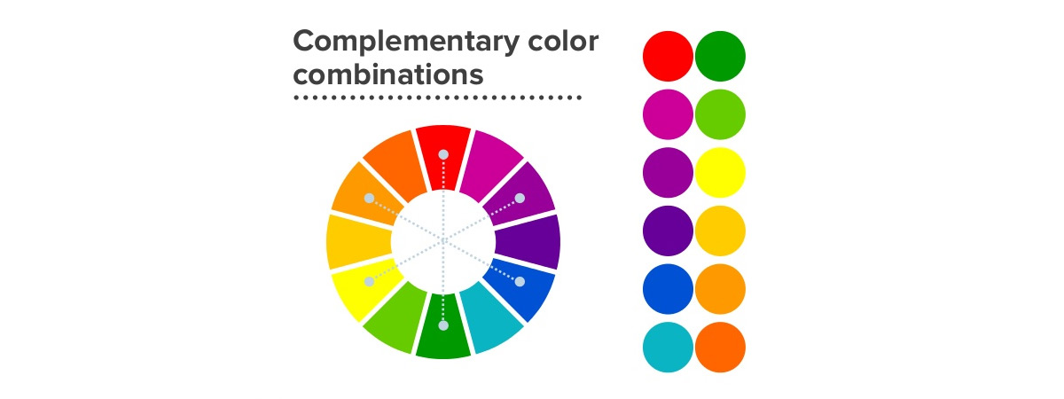
The most basic type of color harmony is a complementary one. Choose a color, then look at which color sits directly opposite it on the color wheel. Those two are complementary colors. Complementary colors are colors that starkly contrast each other, so when they’re used together in a logo, both colors are bold and eye-catching.
Choosing complementary colors for your logo keeps your palette simple, but with simplicity comes limits. You’ve only got two colors to work with – two contrasting, bold colors. For some brands, that’s all they need. Others need to use three, four or even more colors in their logos to tell their audiences the whole story.
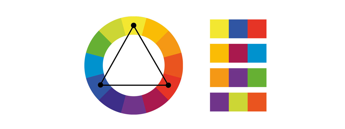
Triadic Trios
A triadic harmony is one created with three colors. Specifically, three colors that sit at equal intervals on the color wheel.
Like a complementary color palette, a triadic one has high contrast and can be a great way to create a varied, colorful logo. And since there’s three colors to play with, rather than just two, you can do more with a triadic palette – like illustrate a more complex image or communicate more points about your brand.
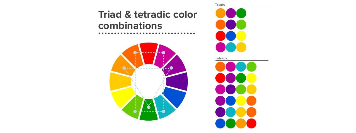
Tetradic Teams
Based on the name, can you guess what kind of harmonies these will be?
Yup, they’re groups of four colors. Specifically, they’re groups of four colors that sit in a rectangle shape on the color wheel – two sets of complementary colors with one “buffer” color between them. This is why they’re also known as double complementary color schemes.
You might choose red and green and purple and yellow. Together, these four colors are punchy. They’re bold, they have start contrasts and when you’ve got all four in one palette, the palette can look quite busy. It’s perfect for a high-energy, “in your face” kind of logo that’s got a lot going on.
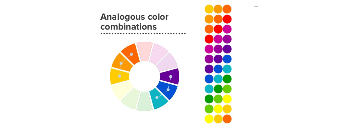
Analogous palettes
An analogous color harmony is one created by grouping three colors together that sit next to each other on the color wheel.
This kind of palette creates a drastically different effect from the other kinds we’ve discussed so far. Since you’re pulling from colors that are closely related, you don’t get the level of contrast you get with colors from opposite sides of the color wheel. There’s still some contrast, though – and you can play with it by trying out different shades and tints of the colors you’ve chosen. The end result is a less extreme palette that’s perfect for brands seeking a subtler look.
One color, one palette
An analogous palette might seem limited, but you’ve actually got another option that’s even more limited: a monochrome palette. As its name implies, a monochrome palette is a palette that only has one color.
Which, by definition, isn’t really a color palette...right?
Actually, it can be. With the help of white, black and gray, you can create a whole palette using just one base hue.
By using just one color and building out a palette by lightening, darkening or washing it out, you can craft a complex logo with a deep, cohesive look. This kind of palette is often a great choice for brands who have a clear, singular mission and brands that want to keep their logos simple without settling for simplistic.
But what about the other colors?
As you’ve probably noticed, we haven’t mentioned a few important colors yet:
• Black
• White
• Brown
• Gray
Sure, we mentioned shades, tints and tones, but we didn’t mention black, white or gray on their own. And the word “brown” hasn’t been mentioned at all.
Here’s the scoop on these hues: they’re not like other colors. Black and white don’t have specific wavelengths like the colors on the color wheel have, which makes them impossible to fit onto the color wheel. But although some sources say they aren’t technically colors, this doesn’t tell the whole story.
For designers, black, white and gray are colors. They don’t fit into specific color harmonies, but they can be used effectively in logos as either the primary color or an accent color.
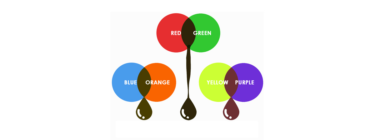
Similarly, brown isn’t on the color wheel. But that doesn’t mean it’s not a color. Brown is the color you get when you blend two complementary colors. So red + green = brown, as does yellow + purple and blue + orange.

And just like black, white and gray, brown doesn’t fit into any of the specified color harmonies we discussed above. But it can absolutely be an effective color choice for your logo, either as your main color or one of your accent or shadow choices.
Design a logo with the perfect colors for yourself
If you don’t have spare cash in your budget for a logo, don’t despair. While in the past you may have had limited options, nowadays technology has advanced so that virtually anyone can design their own logo using an
online logo design tool like logogenie.
In our digital era, design software is less about the technical skill of your hands and more about your creative ideas. You don’t need to master your brush strokes or pencil shading — you don’t even need steady hands. With digital logo makers, all you need is an idea.
Logogenie, and other online design tools, use templates to make design fast and easy, even for first timers. First, you select your industry from the dropdown menu.
We’ve categorized our templates by the needs and demands of the top industries, so finding yours is the first step. Our algorithm will then generate the top choices for your industry.
Simply choose the one you like and start editing. You can customize each template however you want, personalizing your choices for:
- Main images
- Company name and slogan
- Font and typography
- Color schemes
- Text and picture sizes
- Text and picture placement
- Adding new icons
- Layering (putting some images behind or in front of others)
You can choose from our internal library of over 200 icons. A quick glance shows that there are plenty of the intellectual imagery we mentioned above, including trees with rainbow leaves, shield crests, books, graduation caps, and more.
Using a DIY logo maker like logogenie, you can create a professional-tier logo in just minutes. When you’re done, you can buy all permissions and commercial licensing for $24.90, which grants you your logo forever.
While the template-style of design works well for first-timers, you’ll get better results if you bone up on some graphic design basics beforehand. Keep reading our blog for special design tips, straight from expert designers.
