When you’re designing your brand’s logo, there’s three big design choices to keep in mind:
• Shape
• Font
• Color
Shape refers to the overall shape of the logo and the shapes used within it, and font refers to the font (or fonts) you choose. Both of these design choices communicate your brand’s personality. Color works right alongside them, adding another dimension of meaning. This is because our brains make connections between emotions and colors.

Think about it – another way of saying you’re feeling sad is “I’m feeling blue.” And when somebody’s angry, you might say they’re “seeing red.” Going green means making choices that won’t negatively impact the environment, and referring to something as the “gold standard” means its the top of its class. So when you choose specific colors for your logo, you’re choosing how people view your brand. Learning how to harness color psychology effectively is one of the most important branding skills you’ll ever develop, especially as you move beyond your logo and start designing other assets like your brand’s website and merchandise.
Take a look at all the different ways you can communicate through color. As you read through each color category, think about your own brand’s attributes and whether that color matches them. If so, shortlist that color for your logo – it might be the perfect shade for your brand. While you're at it, you might want to read our article about color combinations as well
Black
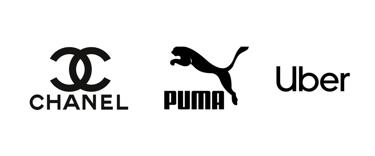
No matter where you use it, black always exudes an air of mystery. Black reminds us of the night sky and everything it cloaks in darkness. It’s an ominous color, a mysterious color and even a sexy color, as there’s something titillating about the unknown. Luxury brands use black in their logos to communicate exclusivity, and any brand can use it to express power.
Design a black or primarily black logo if your brand is defined by its mystery or edginess. If your target audience is one who describes themselves as slick and modern, go black. Black can work for a brand in any industry, as long as that brand is a commanding presence meant for consumers who know a good thing when they see it.
White
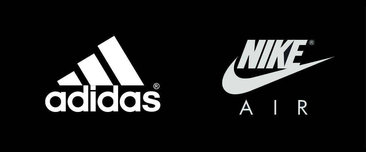
White’s often seen as the opposite of black. And when it comes to color psychology, there’s some truth to this. While black is the color of edginess and mystery, white signifies purity and cleanliness. That’s why it’s such a popular color for cleaning brands and by extension, pharmaceuticals and cosmetics. Any brand that appeals to consumers by being unadulterated and clear can do just that with a white logo.
But a white logo can be very difficult to pull off because in most cases, it needs to be paired with a colored background. A lot of brands, like Mini, choose black because of the start contrast it provides and the opportunity to work all of black’s luxury-communicating power into their logos. But you don’t have to go with black, or even set your white logo against a colored background.
Gray

When black feels too dark, white feels too light and other colors feel too, well, colorful, go with gray. Gray is a neutral color that can work for a brand in any industry. Gray is strongest when it’s used to communicate that a brand is calm, reliable and/or old-school. Think of a cozy pair of gray sweatpants or a wise old elephant. Being gray doesn’t make them boring, it’s just part of what makes them themselves.
Sometimes, silver logos are categorized as gray logos – but we’ve split them up because there are important nuances between gray and silver that you shouldn’t ignore. Gray logos often have a matte look, and that matte look creates a much less provocative, less flashy feel than a glossy silver logo.
Blue

Blue is cool, calm and collected. It’s cool water splashing against your hot skin; it’s falling asleep to soothing music. Choose blue if your brand is tranquil and calming.
Blue is also the color of choice for any brand that aims to come across as trustworthy and professional. Banks and consulting firms often choose blue for this reason. It’s also the right color if you want to reduce any stress your buyers feel when interacting with your product, like the stress non-techy people often feel with electronics or hesitation making large purchases.
Purple
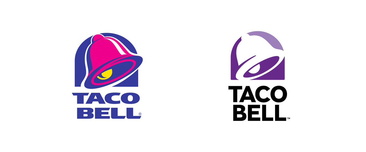
Traditionally the color of royalty, a purple logo still has a regal feel. Like black, purple feels luxurious. But unlike black, purple feels a little “extra.” It’s not minimalist luxury, it’s maximalist luxury for the consumer who wants to go all out and make sure everybody knows exactly what they’re into.
Going with its tendency to be the “extra” color, purple is also a whimsical, fun color. Brands that view themselves as quirky and willing to be unconventional can tell the world who they are with a purple logo.
Green

When a brand’s logo is primarily green, it’s usually because that brand is focused on plants, the planet or health in some way. All of these ideas are connected – a plant-based diet is typically regarded as the healthiest diet for humans and their environment, maintaining green spaces by reducing waste leads to cleaner air and water and overall, the better condition we keep our planet, the better off we’ll be.
If healthy consumers and/or a healthier planet is one of your brand’s top values, green is the way to go.
But as you look at some more famous green logos, you’ll notice they aren’t all for environmental brands. That’s because green doesn’t only imply health and an eco-focus, it can also symbolize money, luck, wealth and rebirth. Green is a soothing color, perhaps because of its association with the natural world. It symbolizes freshness, which also makes it a great choice for a line of breath mints or an envelope-pushing tech company.
Red

Red is the color of passion. That could be a happy, excited passion or a raging anger. Regardless of the emotion driving it, passion is passion, and passion is always red-hot.
If your brand is one driven by strong emotions or any other kind of heat (like a hot sauce company), red is your go-to logo color. Red is a huge attention-grabber, so even if your brand isn’t go-go-go, using red in your logo is a sure way to demand viewers stop and look at what you’ve got to offer.
Pink

Pink is red’s lighter, softer sibling. Often, pink is considered the most feminine of colors, which can make it a great choice for a brand whose primary consumers are women.
But simply saying pink = feminine and leaving it at that doesn’t do the color justice. Pink is a versatile color that can communicate a lot about a brand, like its playfulness or youthfulness. If your brand’s all about fun and vibrancy, pink has a place in your logo.
Orange

Like red, orange is a color with a lot of energy. But unlike red, which takes its energy from raw, even aggressive, emotion, orange is more of a fun, outside-the-box kind of energy. As the midpoint between red and yellow, orange often symbolizes change – so if your brand is all about transitions, consider making orange your logo’s primary color.
Orange is playful and quirky, much like purple. But unlike purple, orange doesn’t have a luxurious quality. In fact, it has the opposite: an accessible, inclusive quality. If your brand is a brand for everybody, say so with an orange logo.
Yellow

In reality, the sun burns bright white. But in most depictions, it’s yellow. Why? Because we characterize the sun as a beaming, gregarious character, and there’s no friendlier color than yellow.
Yellow is a great choice for any brand that’s fun, bouncy and doesn’t take itself too seriously. It’s a great color for a children’s or pet brand, as well as any brand that’s focused on friendship and having a good time.
Brown

Brown is reliable. Brown is always there and always will be. Brown’s old-school, brown’s safe, brown’s comforting...think of things like warm brownies and the wood grain walls of a cozy cabin.
When you want to show your consumers they can depend on your brand, go with brown. Similarly, use brown to give your brand an Earthy, outdoorsy feel. Brown’s the color of dirt and tree bark, after all, and nothing’s more reliable than Mother Earth.
Brown is also an obvious choice for a coffee or confectionery logo. Overall, you don’t see a ton of brown logos, so choosing one can also be a way to make your brand stand out among its competitors.
Metallics

As we mentioned above, we’ve created a separate category to discuss metallic logos. Silver, gold, chrome and even glossy rose gold and bronze logos fit in here because they’re too distinct from their matte counterparts to just lump together. And they don’t just look different, they communicate different traits about the brands that use them.
A metallic logo, particularly a gold or silver logo, makes viewers thing of precious metals and jewelry made from them. By emulating expensive jewelry and other prized objects like trophies and Olympic medals, brands use metallic logos to show the world that their products are status symbols.
Multi-colors
There are a few reasons to use more than one color in your logo. The most basic is aesthetics. Pairing a light color with a darker shade of the same color can give your logo depth, creating a three-dimensional look. Light shades can also highlight text and imagery within a logo. Contrasting colors make each other – and the text and images created with them – pop, and similar colors grouped together are often very pleasing to the eye.
But there’s another important reason to use multiple colors in your logo: to show you’ve got a multidimensional brand. Let’s say you’re a boutique tech brand. A black logo establishes you as the brand of choice for a serious consumer, somebody who’s willing to pay a bit more to get high-end electronics and top customer service. But if you want to communicate that you’re also a brand that’s on the cutting edge of your industry, always the first to bring new technologies to the market, a dash of red in your logo can do just that. Take note of how Tesla uses red and white in its logo to communicate that not only does the company continually introduce industry-changing technology to the auto market, they continually introduce clean technology to the auto market.


