Although we tend to think highly of the education industry because of its altruistic goals, schools and educational companies are not above influencing their reputations with branding. The truth is, educational branding is as much an academic tradition as late-night cram sessions. After all, most schools already have mascots, slogans, and recognizable color schemes. All they need is an amazing logo to tie it all together.
Luckily, you don’t have to be Ivy league to design a world-class logo. Even if you’re a local preschool, an adult education center, or maybe an educational startup, you can still create a logo that both communicates what you do and gets people excited about enrolling, buying, or learning from you.
In this guide, we’ll cover the best education and school logos, and explain what makes them the best with takeaway tips you can apply yourself. We’ll also explain how you can make an A+ logo on your own without any design experience, and save hundreds of dollars doing it!
10 Best Education and School Logos
From billion-dollar universities to small-scale learning workshops for adults, this list covers some of the most effective logos for schools and educational companies — and what they do that makes them so effective.
1. Notre Dame College

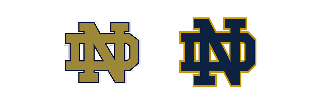
The Notre Dame logo is not only one of the most famous educational logos, it’s also one of the most famous logos in general. Although this isn’t their official crest logo, nor is it their “Fighting Irish” mascot, this famous ND is still the most common and recognizable of the school’s emblems.
In logo design, emblems that use initials — typically interconnected — are called “monograms.” This style is more sophisticated than pictorial logos, especially when using a serif font like Notre Dame does. At the same time, monograms still allow for creativity and fun designs, making them a good middle-ground between casual and professional.
One of the key aspects of the Notre Dame monogram is that it alternates the primary and secondary colors — sometimes it’s gold with a blue outline, others it’s blue with a gold outline. However, it always uses the school’s official blue and gold because using color consistency is crucial for branding. This two-variation design opens up a lot of doors for placement, where they can choose whichever color fits the location best.
2. Peak Education
Moving on to more local businesses, Peak Education is a high-school tutoring agency with peak branding.
For starters, the mountain is worked into their P lettermark, a perfect example of using associated imagery, in this case a mountain to denote “peak.” This kind of visual wordplay is ideal for name recognition and helps people remember your brand long after they see your logo.
The mountain itself is also designed well. It’s rather simplistic, just a bisected triangle, but the use of colors and the way it connects to the stem of the P make it an interesting visual, a pleasure to look at. The use of gradient colors, too, adds extra attention, and that particular shade of purple plays well with the deep blue.
Last, the letter A in the name is a bright pink, again a great use of colors. Not only does it match well with the deep blue and purple, but it also makes the entire logo more dynamic, and therefore more memorable.
3. Origin Code Academy

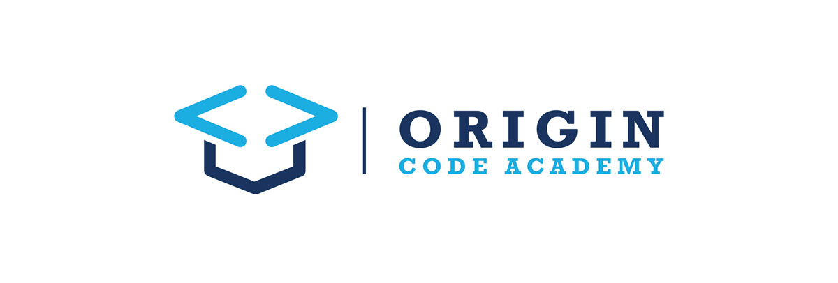
Just as Peak Education uses a mountain in their logo, Origin Code Academy also uses associated imagery — but they take it to the next level.
For specialized schools and educational companies, it’s vital to communicate what that specialization is the instant the viewer looks at your logo. Aspiring coders — the ones who are interested in coding school — will recognize the coding tags < and > in the logo, a clear cue to entice and engage them.
But forcing in visual signals isn’t enough for a good logo. Origin Code Academy does this smartly by combining the imagery with another academic icon, the graduation cape. This communicates the necessary information, that this is a school for coders, but does so in a fun way that the viewer will likely remember the next time they’re wishing they knew coding.
4. Duolingo
At the fringe of the education industry, language-learning apps have carved themselves a niche among both serious and casual language-learners. Chief among them and one of the oldest is Duolingo, with their green owl mascot who was so popular, it did a stint as a trendy meme.
Duolingo branding has to walk the line between the education and technology industries, but their carefully designed owl logo succeeds with flying colors. On the technology aspect, the “flat design” style stays current with the competing apps, while using the intellectual symbol of the owl satisfies the education aspect.
Notice the bright colors and large eyes of the bird, both of which appeal to younger and more carefree users. This takes away some of the seriousness to learning a new language, and attracts gamers and casual learners, two of Duolingo’s top markets.
5. The Smith School
The Smith School is a small private school in New York, a far cry from the big budgets of international universities or global apps. However, that doesn’t stop them from having a world-class logo.
First, the logo demonstrates the effects of circles and curves in graphic design. Curves are aesthetically more playful and inviting than straight lines, so circular logos come across as warmer and friendlier. The soft pastel colors add to this effect, creating the impression that this school is gentle and calm.
But those circles also create meaningful shapes in the sunrise and the leaf. These natural elements also make the school seem more accessible, as well as conjure associations of “a new day” and personal growth through plant growth.
6. Baton Rouge International School
Another excellent use of associated imagery, the Baton Rouge International School features a globe-like shape to express their worldly aspirations as an international school. The logo also features a bit of mind-bending visual effects with how the ribbon-like strands connect, making it enjoyable to look at.
The color usage is also worth mentioning, as they include an assortment of bright colors (good for children), but the design centers around light blue, a popular choice for branding because it elicits trust. But for fear of looking boring, they also add a nice sheen to the graphics, adding depth to the globe-like shape.
It’s also worth mentioning that they faded the words “Baton Rouge” to put more emphasis on the darker “International School” text. This is a favorite technique of graphic designers to give certain words more importance than others.
7. From Sounds to Spelling
From Sounds to Spelling is another specialist school, this one focusing on phonics and reading (cleverly included in the logo so first-time viewers know what it’s about).
This school uses a few of the successful themes for educational logos, such as tree imagery, children, and bright colors. In fact, their color usage is particularly noteworthy, using two different shades of green for more visual stimulation, but anchoring it with a dark gray/light black.
What works best, though, is the imagery. Using letters as the leaves on the tree may be abstract or experimental, but it’s a risk that pays off. Somehow, in conjunction with the children playing underneath, it’s clear that this school helps children learn reading skills — and judging by the kids in the logo, they’re much happier for it.
8. Advanced Trainings
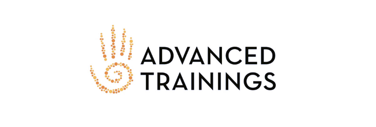
Here’s another specialist school that incorporates their subject matter into the logo. Advanced training is an educational resource for aspiring massage therapists (they need education, too!), offering in-person, online, and second-hand courses.
Not only do they incorporate massage into their logo through the hand imagery, the artistic style is also designed masterfully. We mentioned above that curves tend to draw viewers in; the spiral, then, takes this effect to extremes with almost hypnotic imagery.
But the image itself is composed of tiny circles, which only adds to the playfulness and friendliness. The warm colors (yellow and orange) further the effect, and the final product has a powerful influence reinforced by overlapping design elements.
9. The Outdoor
Colors are important for education logos, and those aimed at younger students benefit from a wide variety. The Outdoor understands this well with their rainbow of leaves, echoed in the multi-colored typography at the bottom.
This logo is strikingly similar to the From Sounds to Spelling above, and for good reason. Both use common best practices for educational logos, like tree imagery and children, and both anchor the bright colors with a dark silhouette.
The big difference is the colors, which The Outdoor handles well. The diverse colors of the tree are more than just a fun visual — they make the service seem more enjoyable, a big selling point for both children and their parents. By adding colors to the silhouettes of the children, the cape and the bow, the logo brings attention to them rather than letting them fade to the background.
10. University of Texas
Last, the University of Texas logo may be simple, but that simplicity is one of its greatest strengths.
For one thing, the long-horned cow is a fitting mascot for the university’s sports teams, the Longhorns. Playing off connotations to cowboys and cattle herds, the choice of a cow logo taps into Texan culture, which naturally is a big draw for Texan applicants.
Some may say the use of one color is bland, but considering that it’s the dominant school color, it’s a smart choice. Especially for schools closely connected with sports, rallying students and alumni is critical — prioritizing a single color helps unify their base, for example, by giving them something to wear to show their support.
How to Design Your Own Education or School Logo: 6 Expert Tips
What should you take away from the 10 best education and school logos above? What advice can you use when designing your own logo? Follow these 6 tips below, recommended by design experts.
Bright Colors for Kids, Muted Colors for Adults
If your target students are children, using a rainbow of bright colors makes your school (or service) seem more fun. Fun is often the top priority for young kids, but it’s also appealing to their parents/guardians, who want their children to enjoy themselves while learning. That’s why school logos aimed at younger children often feature bright and pastel colors, and lots of them.
However, the older the student, the less appealing “fun” is in a school. If you’re targeting adults, they’re going to be more concerned with quality, reliability, and proficiency, all of which are better represented by more muted and darker colors.
That’s why you should always tailor your color scheme around your target audience. Warm colors (red, orange, yellow) at bright hues work best for attracting younger students, while cold colors (light blue, dark blue, purple) are best for older students. Similarly, children prefer many different colors, while adults respond to simpler one- or two-tone logos.
Shields and Crests Seem More Authentic
Academic institutions, particularly colleges, have a long and rich history — some of which, like Harvard University, are older than the U.S. itself! History and tradition can be valuable selling points to some target markets, like those who prioritize authenticity and dependability above all else.
While your school or company probably wasn’t around in the Middle Ages, you can still borrow those themes and iconography to give your brand a more “traditional” feel to it. For schools, the shield crest is the best option, since they actually come from a time when logos were shield crests.
Feel free to have fun with it, too. While real shield crests used imagery like swords or laurel leaves, you can “update” yours with more modern inclusions, or even silly cartoon aspects just for laughs.
Intellectual Imagery
As we pointed out above, associated imagery is a staple of most of the top education logos. The goal is to communicate instantly what your company does, so that people who see your logo just for a second still know who you are and what you do. For that, using visuals is more effective than words — 1000 times more effective, as the adage goes.
You can communicate more clearly if you use the common icons associated with education, schools, or intellectualism in general. While these vary in different cultures and regions, some of the most common intellectual imagery are:
- Books
- Writing materials
- Owls
- Graduation hats
- Pencils
- ?Microscopes
The idea is that, if people see an owl or a book in your logo, they’ll automatically think it has something to do with education. That split-second of recognition beats whatever words you add to clarify, so choose your imagery wisely.
Tree Imagery for Growth
Another common image for education logos is trees — not because they symbolize learning, but because they symbolize growth.
Tree imagery is a little more roundabout, but just as powerful. Growth is at the heart of all education; students start knowing just a little and end knowing a lot. Instead of spelling that out in words, using tree imagery is a more poetic and subconscious way of expressing the same point.
There’s also the added benefit that children play around trees, another useful association. As two of the best education logos above show us, it’s easy to create a sentimental scene around an image of a tree, not to mention the artistic opportunities like The Outdoor’s creative rainbow leaves.
Sports Mascots
Sports branding is worlds apart from education branding, but for some schools, the two are one-and-the-same. If your education company has a sports team that’s integral to your identity, you may have to walk a tight-rope with your branding.
The best middle-ground is to use a mascot with your sports team that satisfies both needs. The Longhorn logo for the University of Texas is a prime example. One the one hand, the cow directly represents their team, named the Longhorns, and the aesthetics of the long horns themselves suit aggressive sports branding.
But at the same time, the logo isn’t overtly aggressive like most professional sports mascots. It’s a simple cow, so still applicable to other industries. And by using the uniform orange that’s their school colors, they still maintain the brand consistency that encourages new enrollment and alumni contributions.
Include Specializations
If you’re a specialty school or service, like Advanced Training or Origin Code Academy above, it’s crucial to advertise what you specialize in. Other educational brands can market to general audiences, but specialty schools have to go the extra mile to reach and entice their marginalized niche.
You can achieve this by using an accompanying text with your logo, but communicating visually is more effective. Like Origin Code Academy, try to think of a clever way to merge visuals for your specialization with the broader education industry. For example, a woodworking school might use a beaver wearing a graduation cap. Now’s your chance to be creative!
How to Make a Education Logo
Now that you have an idea of what goes into an effective education logo, the question is, how do you make one? Essentially you have two options: hire someone to design it for you or design it yourself. Both have their own merits and drawbacks, so let’s examine both individually.
Hiring a Designer
Professional designers know by heart all the tips, tricks, and techniques we’ve mentioned above, and then some. When you hire a designer, freelance or from an agency, you’re buying their expertise just as much as their time.
The problem is, no skilled designer works for free. The most glaring downside of hiring a designer is the cost — talented designers charge hundreds or even thousands of dollars for logo design.
Sometimes you can find cheaper alternatives on sites like Fiverr, but those sites have a poor record for delivering what they promised, and there’s tons of ex-Fiverr users who felt they were ripped off. The industry standard for a logo design is around $200, so if someone charges $5, you’re right to be suspicious.
Moreover, even if you have the money to spare, it can be difficult to find the right designer for you. Graphic design is a creative field, so there are innumerable artistic styles to choose from. You have to be sure to find a designer who both understands your vision and is capable of bringing it to life, but that can take time.
Design a Logo Yourself
If you don’t have spare cash in your budget for a logo, don’t despair. While in the past you may have had limited options, nowadays technology has advanced so that virtually anyone can design their own logo using an online logo design tool like logogenie.
In our digital era, design software is less about the technical skill of your hands and more about your creative ideas. You don’t need to master your brush strokes or pencil shading — you don’t even need steady hands. With digital logo makers, all you need is an idea.
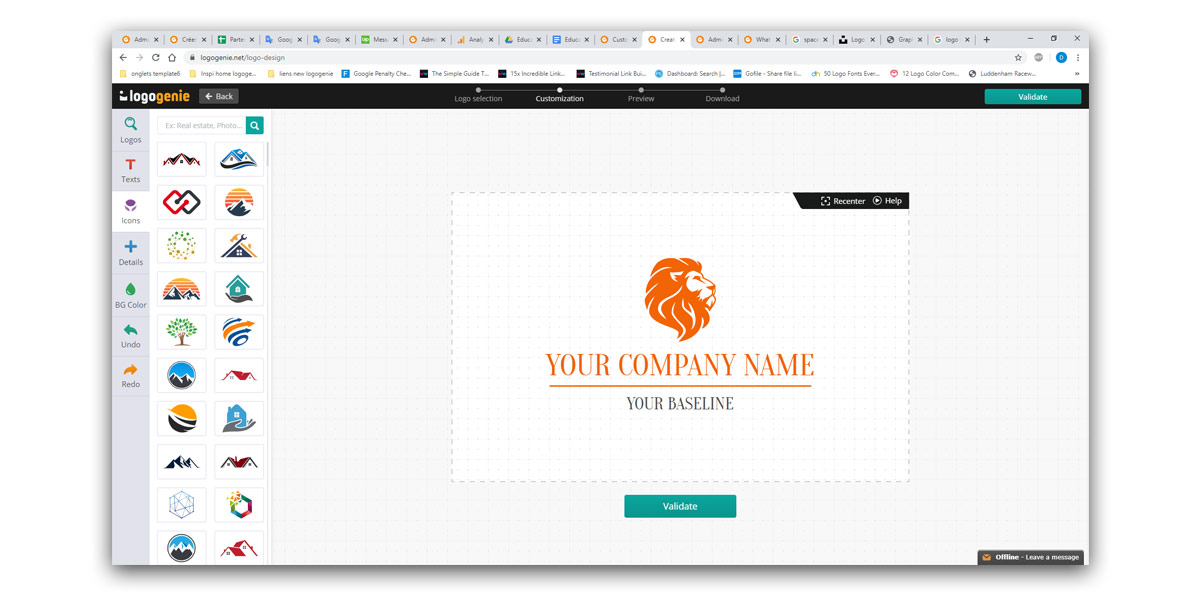
Logogenie, and other online design tools, use templates to make design fast and easy, even for first timers. First, you select your industry from the dropdown menu.
Our algorithm will then generate the top choices for your industry, in this case, education and schools.
Simply choose the one you like and start editing. You can customize each template however you want, personalizing your choices for:
- Main images
- Company name and slogan
- Font and typography
- Color schemes
- Text and picture sizes
- Text and picture placement
- Adding new icons
- Layering (putting some images behind or in front of others)
You can choose from our internal library of over 200 icons. A quick glance shows that there are plenty of the intellectual imagery we mentioned above, including trees with rainbow leaves, shield crests, books, graduation caps, and more.
Using a DIY logo maker like logogenie, you can create a professional-tier logo in just minutes. When you’re done, you can buy all permissions and commercial licensing for $24.90, which grants you your logo forever.
While the template-style of design works well for first-timers, you’ll get better results if you bone up on some graphic design basics beforehand. Keep reading our blog for special design tips, straight from expert designers.
Start designing your logo
