From Chef Boyardee to Whole Foods, everyone in the food, drink, and groceries business needs a logo. Whether a cartoon mascot to delight kids or maybe a food pun to delight adults, food and drink logos can make a good impression, improve brand recognition, and even make people a little hungry!
But even if you’re more of a “Little Debbie” than a “Famous Amos,” you can still get a top-tier logo that fits your budget. In this guide, we’ll analyze ten of the best food & drink logos and list some practical design tips so you can make a professional-quality food & drink logo on your own.
10 Best Food & Drink Logos
Walk down the aisle of any supermarket and you’ll see dozens of unique logos — but some are better than others. Below, we collect ten of the best food and drink logos and explain what makes them so great, so you know what to aim for.
Whole Foods Market
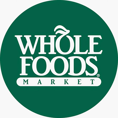
Although the Whole Foods logo isn’t a typical logo for the food and drinks industry, it is a well-made one, so a good place to start. The main emphasis is on the typography and the look of the words “whole foods.” The only picture is the fruit in the O, but that works to their advantage because that gives it extra attention. In a busier logo, turning the O into a fruit might go unnoticed, but here it’s a central focal point.
The color green isn’t a common choice for the food industry, but it’s a smart choice for Whole Foods because of their brand identity. Whole Foods wants people to associate their brand with concepts like “natural,” “fresh,” and “healthy,” and green conjures up all of those.
Kellogg’s
Wordmark logos — logos that are only the name of the company — are found more in formal industries like legal or financial because they’re more ascetic. Kellogg’s shakes off that formality with their bubbly, playful font; the word itself becomes the picture.
Because the only visuals are the letters, Kellogg’s took great care in designing them. On close inspection, you’ll notice tiny and deliberate inconsistencies, such as the two Ls are different heights or the two Gs have different tops. If you’re designing a wordmark logo, you have to get down in the weeds to make the letters as dynamic as possible, otherwise you risk having a boring logo.
You’ll also notice the color, a vibrant red, helps keep the logo interesting. Using eye-catching colors is another expert designer trick for sprucing up wordmark logos.
McCormick

Famous for their spices, McCormick takes a different approach than other typical food logos. Squares, straight lines, and serif fonts are elements used in more serious businesses and seem out of place for food, but McCormick uses them to its advantage.
So why does this logo work at all? McCormick’s trick is color. For starters, just like Kellogg’s, McCormick utilizes a vibrant red to make an otherwise stiff logo seem more fun. Moreover, color differentiates the M and the C in the box, allowing for more artistic visuals.
The combination of the M and C is a great example of the importance of creativity in logo design. Combining those letters makes the logo more memorable, but applying it is more intricate than it looks. For example, the style of the letters was chosen with care so that the M and C could both connect in a straight line. Even once they were connected, they were separated by a small gap for readability.
Dole

With Dole, we start to recognize some common traits of food logos. The color red, blue accents, and the recurring imagery of the sun.
Dole’s logo is so powerful because it’s simple — another wordmark logo, but jazzed up with the central image of the sun. The rays of the sun act as leading lines to draw in your attention, a good technique for logos. Centering it around the O in Dole is the icing on the cake. .
The blue bottom is also worth mentioning. Blue is a useful accent color for food logos because it grounds the warm shades, especially red. The contrast makes the two colors play off each other — but only when there’s a minimal amount of blue. You don’t want your colors competing.
Homespun Chili
Moving away from household brands, Homespun Chili has an additional goal for their logo: get people to remember their name. Small food companies have to try even harder with their logo if they want it to become as recognizable as the logos of industry leaders.
Homespun Chili relies on common trends like food imagery and the color red, but puts a new, quirky spin on them for extra memorability. The swirls and loops are among some of the most playful imagery you can use, so this logo presents an unknown company as friendly and inviting.
Swirl
The Swirl logo shows that you can use alternative styles for food logos, even minimalism. Sometimes it pays to set yourself apart, and Swirl’s logo does just that.
It maintains some of the food logo trends, but puts a custom twist on them. For example, they have a picture of food, but it’s done in an original style. You’ll also notice that they favor pink instead of red like the other food logos. Pink has the same attention-grabbing benefits as red, and is just right next door on the color wheel.
Chiquita
Chiquita introduces the concept of mascots to our list. “Miss Chiquita,” as she’s officially called, was first drawn by popular cartoonist Dik Browne, the creator of the newspaper strips “Hagar the Horrible” and “Hi and Lois,” and modelled after real-life singer-dancer Carmen Miranda. Her tropical culture complements Chiquita’s flagship product, bananas.
Notice how, because the Chiquita stickers are so small, the character is drawn very simplistically to enhance visibility. This is a good lesson: always keep in mind where your logo will appear when you design it.
Another interesting tactic is the use of blue. Typically, blue is only used as secondary colors or accents in food logos, but Chiquita has a trick up their sleeve — they know these stickers are going on bright yellow bananas, which pairs perfectly for blue. When looking at the whole banana, the sticker is just a small part, meaning the blue is still ultimately just an accent color.
Horizon Organic

Horizon Organic specializes in dairy products, so a cow makes a good mascot. The cartoon style makes it more appealing to children, a main market for dairy products and milk in particular. Even if they’re not the ones buying it, children still influence purchasing decisions.
Like Whole Foods, Horizon Organic uses the logo to associate their brand with concepts like “healthy” and “natural.” However, they opt for a picture of the Earth to achieve the same ends.
Earthbound Farm
Earthbound Farm combines a lot of the other techniques we’ve seen in previous logos: the color red, images of the sun, and green to seem healthy and natural. The use of these trends shows that the Earthbound Farm designers created this one by the book for an effective and efficient logo.
Betty Crocker
At the helm of an iconic brand, the Betty Crocker logo has endured decades with only slight tweaking. This consistency does wonders for brand recognition, as loyal customers need only to look for the red spoon on the box.
Although the typography of the Betty Crocker logo has changed a little, it has always retained that handwritten style, almost like a signature. This is a great choice for seeming personal with your customers, especially when the company name is a person’s name.
The red spoon itself is on-the-nose. The spoon, especially a wooden cooking spoon, is reminiscent of baking and ticks the right boxes for the chefs and cooks that favor Betty Crocker products. And the red, as you already know by now, suits the food industry perfectly.
How to Design Your Own Food & Drink Logo: 5 Expert Tips
Based on what we’ve seen above, here are 5 takeaway tips for designing your own food logo.
Red and Other Warm Colors
It’s no coincidence that nearly all the best food logos used red. Expert designers know that red causes increases hunger, purportedly because of its connotations with blood. That explains why most major food brands use red, and lots of it.
Red matches well with other warm colors like yellow or orange, which is why you often see them used as accent colors. Warm colors in general tend to be happier and friendlier, which suit the food industry because, at its core, food makes people happy.
Pink, too, is often used in food branding, although not interchangeably. Pink is one of the best color choices for sweets and candy (or ice cream, like Swirl), reminiscent of youth when those foods were more significant.
Appetizing Food in the Logo
One of the goals of a logo is to communicate what you do instantly through visuals. With that in mind, it’s obvious to include pictures of food in your logo, especially when integrated in the rest of the logo like Whole Foods.
But since you’re including an image of food anyway, you might as well make it look delicious. Appetizing food in your logo not only communicates what you offer, it also entices people to have a bite. Food has such a primal effect on us, even seeing a picture of it is enough to make our mouths water.
Of course, other symbols represent food as well. Utensils like forks or Betty Crocker’s wooden spoon also signal the food industry, as do the plants from which fruits and vegetables grow.
If you’re narrowing in on healthy foods, like natural or organic, you have a lot of new icons open to you. The sun is a popular one because it denotes growth, health, and happiness.
Cultural References for Cuisine Types
A lot of foods are closely associated with geography and culture. Sometimes, it’s where the food itself originates; other times, it’s a culture that uses the food heavily in their cuisine. Those kind of cerebral associations are gold mines for logo design because they’re shortcuts to communication.
If the food you’re selling has cultural ties, lean into them (respectfully, of course). Miss Chiquita is a good example, as her dress is reminiscent of the tropics where the bananas come from. You see this technique a lot with restaurants that focus on a certain type of cuisine, for example, sugar skulls used for Mexican cuisine.
Mascots
We all have our own favorite breakfast cereal mascots, don’t we? Mascots can find a comfortable home in the food industry, which is comparatively more playful than other industries
Mascots are certainly more appealing to younger markets, who as we said above still influence purchasing decisions. If you’re selling to children, an anthropomorphic cartoon mascot is a safe bet.
For adults, though, more realistic food mascots in logos can help humanize a brand, making them seem more like a personal friend than a faceless corporation. Think about Betty Crocker or Aunt Jemima — people talk about these companies as if they’re living, breathing people.
Circles and Curves
Last, because the food industry tends to be more upbeat and positive, it benefits from circular and curvy shapes. In terms of aesthetics, curves make the eye move or “dance,” while straight lines are more rigid and stifling. Sure, straight lines work well if you’re demonstrating stability or proficiency, but for the food industry, it’s more about “having a good time.”
In logos, circles are most commonly used to frame the logo, as with Whole Foods and Chiquita (and Betty Crocker, to some extent). Circular frames are perfect if you want a traditional logo, but not if you want something more modern or unorthodox.
If you want to break away from the pack, you can still use curves predominantly in whatever visuals you use, whether pictures like Horizon Organic, or the typography of your letters like Swirl. You can even “soften” angular corners by rounding them out, a good design technique if you want an imposing logo to be a little friendlier.
How to Make a Food & Drink Logo
Now that you have an idea of what goes into an effective food and drink logo, the question is, how do you make one? Essentially you have two options: hire someone to design it for you or design it yourself. Both have their own merits and drawbacks, so let’s examine both individually.
Hiring a Designer
Professional designers know by heart all the tips, tricks, and techniques we’ve mentioned above, and then some. When you hire a designer, freelance or from an agency, you’re buying their expertise just as much as their time.
The problem is, no skilled designer works for free. The most glaring downside of hiring a designer is the cost — talented designers charge hundreds or even thousands of dollars for logo design.
Sometimes you can find cheaper alternatives on sites like Fiverr, but those sites have a poor record for delivering what they promised, and there’s tons of ex-Fiverr users who felt they were ripped off. The industry standard for a logo design is around $200, so if someone charges $5, you’re right to be suspicious.
Moreover, even if you have the money to spare, it can be difficult to find the right designer for you. Graphic design is a creative field, so there are innumerable artistic styles to choose from. You have to be sure to find a designer who both understands your vision and is capable of bringing it to life, but that can take time.
Design a Logo Yourself
If you don’t have spare cash in your budget for a logo, don’t despair. While in the past you may have had limited options, nowadays technology has advanced so that virtually anyone can design their own logo using an online logo design tool like logogenie.
In our digital era, design software is less about the technical skill of your hands and more about your creative ideas. You don’t need to master your brush strokes or pencil shading — you don’t even need steady hands. With digital logo makers, all you need is an idea.
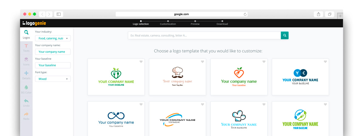
Logogenie, and other online design tools, use templates to make design fast and easy, even for first timers. First, you select your industry from the dropdown menu.
We’ve categorized our templates by the needs and demands of the top industries, so finding yours is the first step. Our algorithm will then generate the top choices for your industry.
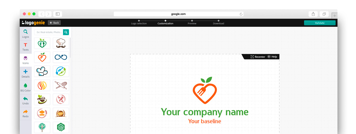
Simply choose the one you like and start editing. You can customize each template however you want, personalizing your choices for:
- Main images
- Company name and slogan
- Font and typography
- Color schemes
- Text and picture sizes
- Text and picture placement
- Adding new icons
- Layering (putting some images behind or in front of others)
You can choose from our internal library of over 200 icons. A quick glance shows that there are plenty of the intellectual imagery we mentioned above, including trees with rainbow leaves, shield crests, books, graduation caps, and more.
Using a DIY logo maker like logogenie, you can create a professional-tier logo in just minutes. When you’re done, you can buy all permissions and commercial licensing for $24.90, which grants you your logo forever.
While the template-style of design works well for first-timers, you’ll get better results if you bone up on some graphic design basics beforehand. Keep reading our blog for special design tips, straight from expert designers.


