Let’s play a game. Say or shout the word “Apple”, depending on your current mood. The more energy you have to expel, the louder you should be. After that word leaves your mouth, immediately close your eyes for a few moments.
Now that you’re back, we have one question: are you more inclined to imagine the fruit or the company who redefined so many aspects of our life through technology?
We admit that you might see the universally recognizable logo before the actual fruit because of the context of why you’re here, but there is still so much to be said about the power behind Apple’s emotional and deeply effective branding. Their logo, the beautifully simplistic, sleek, intelligent and intriguing logo with the bitten apple is arguably one of the most powerful designs in existence. Let’s dive into the hows and whys of it all.
From “Apple Computer Co.” to “Apple”
Apple as you know it now was named after one of the founders, Steve Jobs, had visited an apple farm during one of his “fruitarian diet” escapades. Jobs believed the name to be “fun, spirited and not intimidating”. Originally called the Apple Computer Co., founded by Steve Jobs, Steve Wozniak, and Ronald Wayne (Jobs’ former Atari coworker). The initial work for the company took place in Jobs’ parents’ home in Los Altos, California way back in April of 1976. The three founders had a vision to develop and sell personal computers. In less than a year, that dream turned into reality when Apple Computer Co. became Apple Computer, Inc. in the winter of 1977. There was a significant momentum behind computer sales and the company itself found a huge growth of revenue. This was it.
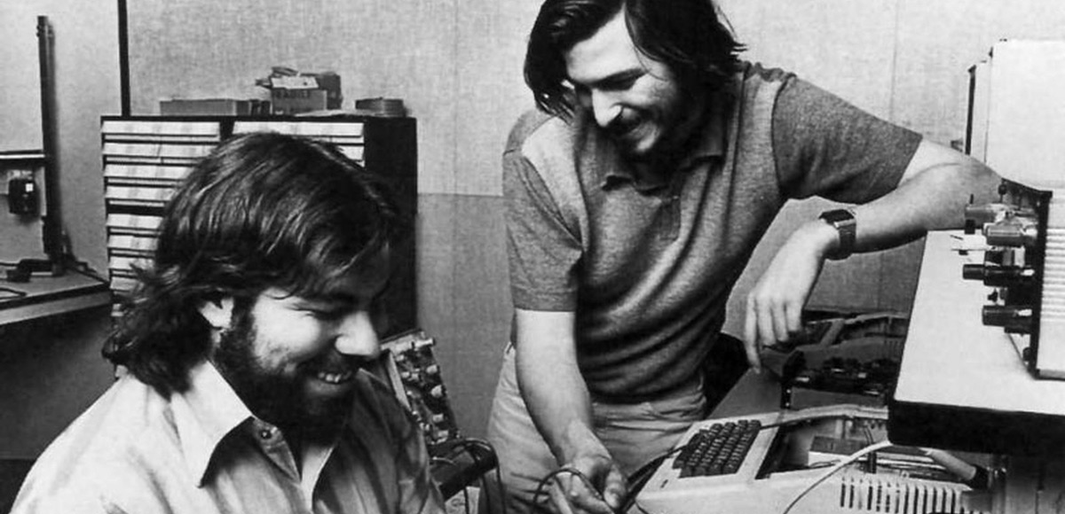
Caption: The birth of Apple in Steve Jobs’ parents’ home in Los Altos, California
Fast forward to 1980, when Apple went public, simplified their company name and found instant financial success. Forty years later, the multinational corporation is so much more than their initial concept. From consumer electronics, to software to digital distribution and finally, to a distinct household name, Apple is one of the world’s most notable brands who helped to not only transform the industrial landscape, but introduce a completely new era of personal computing as well.
A Bold Brand and its Evolution

Caption: The evolution of the Apple logo
The very first logo for Apple was designed in 1976 by two of the founders, Steve Jobs and Ronald Wayne, and inspired by a quote from Wordsworth. Created with India ink, the black and white illustration featured the English mathematician, physicist, astronomer, theologian, and author, Isaac Newton, sitting under an apple tree. Inside of the picture frame read a text from the romantic English poet, “Newton… a mind forever voyaging through strange seas of thought”. The inaugural name of the company, “Apple Computer Co.”, wrapped around the top and bottom on a fabric-like banner.
The following year, Steve Jobs hired designer Rob Janoff, an Art Director at Regis McKenna and well-known for his work with corporate design and branding, to create a new logo for the developing startup. Jobs reportedly believed the first logo to look old fashioned, and it was proven to be difficult to reproduce in smaller sizes.
The only direction Janoff received from jobs was to not “make it cute”. Janoff studied actual apples with bites taken from them in every angle possible. The bite seen in the Apple logo was originally implemented so people would not confuse an apple for a cherry tomato. Janoff’s colleague revealed that "bytes" were the foundation of computing. The nerdy play on words (bite/byte) was an incredibly relevant reference for the tech company, and the happy coincidence of the design has only contributed to its memorability. Janoff brought two versions of the logo to the meeting; one version included a bite and one without. The logo was seen with stripes, as a solid color, and as a metallic apple. The colorful version, dubbed the “rainbow apple”, was chosen. A bold and modern sans-serif font accompanied the apple graphic. The designer himself stated there was no reason behind the placement of the colors themselves, but noted that Jobs wanted to have green at the top “because that’s where the leaf was.”
The apple shape itself didn’t have anything to do with computers. It’s to get people to notice that an Apple computer was not some piece of hard-edged metal that has no place in your home and that your kid wouldn’t want to be near. Lots of different fruits have a stem, are sort of round with a leaf dangling off of it. So the bite in the apple was initially meant to indicate that it was an apple, and not something else. Also metaphorically the bite indicated biting into all the knowledge users would get out of this computer.
What’s funny, though, is after I came up with it my creative director, Chip, said “Oh guess what, Rob. You just designed something you didn’t realize. The word ‘byte’ is a computer word. And you took a bite out of Apple. I wasn’t computer literate enough to see that initially. And I was like, there’s a bit of wit that will last! Any logo that makes a joke or engages you in that way you’re going to remember. And the rainbow colors had to do with the USP of this product. The Apple computer was the only one that could show images in color.”
- Rob Janoff in aninterview with Forbes Magazine
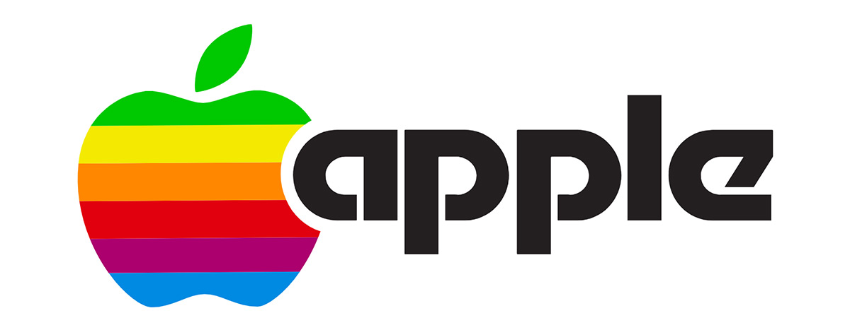
Caption: Rob Janoff’s logo redesign for Apple
This version of the logo was a nod towards the Apple II, the world’s first computer with a full color display. The redesign debuted just before the computer’s launch at the West Coast Computer Fair in 1977. Apple II’s defining feature of color graphics was communicated well through the spectrum of colors found amongst the redesigned Apple logo.
Later on, the revolutionary design firm Regis McKenna, who also helped develop brand identity for competitors like Compaq and Intel, would continue to work with Apple by creating a full business and marketing plan for the company.
It took a few years for the company to realize that colors were complicated to print, and the process in printing the vivid Apple logo was a huge expense. 1984 saw the company typeface replaced with a custom Garamond (called Apple Garamond), the elimination of the wordmark (thank you Landor Associates), introduction of heavy emotional branding and the rise of graphic iconography.
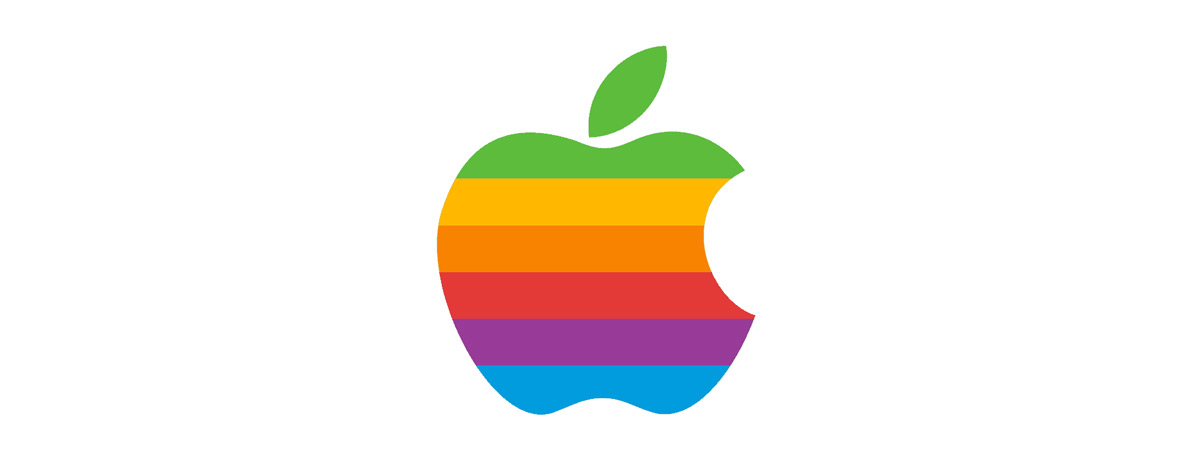 Caption: The rainbow Apple logo
Apple’s Superbowl commercial proved how well their focus in imagination and innovation could allow for their rise to the top. Many argue that this is where Apple’s branding success began. Taking place at some undefined point in the future and featuring a group of expressionless men marching into a dulled, large hall, bright athletes steal the scene as they run through the room to destroy the Big Brother presence on the large screen. After the shock of their arrival passes, a text presents itself: "On January 24th, Apple Computer will introduce Macintosh. And you’ll see why 1984 won’t be like '1984'."
This debut relied on and was successful because of how important community and belonging is, even amongst not-so-inclusive spaces like the beginning of the tech industry. Apple made people feel like they were a part of something exciting.
In 1997, Apple launched their “Think Different” campaign, created by art director Craig Tanimoto. The campaign featured a series of billboards and print advertisements consisting of revolutionary icons through simplistic black and white portraiture. Apple’s rainbow logo beamed from the lower corner.

Caption: Apple’s successful “Think Different” campaign
The company’s typeface was updated once again, this time to the humanist sans-serif Gill Sans.
1998 was the next major redesign for Apple. The logo traded in its colorful display for muted tones, becoming translucent and monochrome. The company released its first ever iMac, the Bondi Blue, so its logo needed to reflect this evolution as the rainbow would have clashed with the sky-blue computer display. This was Apple’s first major update in 22 years.
“Like our products and our customers, the Apple brand continues to evolve. To reflect this, we’ve made some important changes to the Apple logo and how we use it, and how we expect our channel to use it, too. Don’t worry: We haven’t replaced the logo, just updated it. We’ll continue to reflect who we are and what we stand for as a company in the same timeless symbol: an apple with a bite taken out of it. We’ve reduced some of the clutter in the original design, however, and updated the way we use color and light. In other words, we’ve taken the same standards of style and innovation that make our products and our design unmistakable and applied them to the company logo. Instead of rainbow stripes, solid colors. Instead of just one solid color, a palette of logo colors to suit a variety of uses. Solid colors emphasize the timeless shape of the Apple logo”.
- Official statement from Apple following their change from the rainbow logo to the monochrome
Smaller, but notable changes occurred for the next few years. An aqua-drenched version of the logo emerged in 2001. The Avenir font was added to Apple’s in-house favorites and appeared in Mountain Lion and iOS 6. Apple unveiled the iPod in 2003, where Steve Jobs announced a new “tool for the heart”. He urged the audience at the stage in Silicon Valley to imagine “a thousand songs in your pocket” and simultaneously gained additional credibility in the brand. This hype has consistently been a part of Apple’s marketing strategy.
“Marketing is about values. It’s a complicated and noisy world, and we’re not going to get a chance to get people to remember much about us. No company is. So we have to be really clear about what we want them to know about us.”
- Steve Jobs
In 2013, Apple’s logo design shifted to a two-dimensional, flat logo. This allowed for unification across different platforms. Apple’s branding became consistent amongst shop graphics, hardware, tutorial guides and beyond. In 2015, the company dropped Helvetica for the San Francisco typeface. This was implemented across all operating systems and printed materials alongside the release of the Apple watch. Consistency is a major aspect of creating a lasting logo, explaining why the base of Apple’s logo design has been successful for decades. Last year, Apple applied for a brand new trademark for a multicolored icon with the intention to sell merchandise featuring the fresh logo.
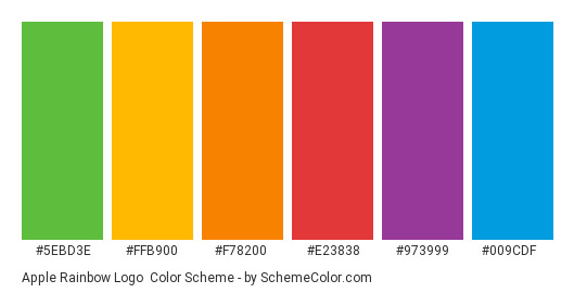
Caption: Apple’s classically modern design Colors
Today, Apple’s modernized “Millennial” logo comes in three colors: silver, white and black.

Caption: Apple’s logo design in black
Its monochrome attributes effortlessly communicate a straightforward and honest aesthetic. Because the bitten apple is widely recognizable and sleek, it inevitably led to a certain kind of intrigue: that being fans and admirers seeking an unspoken truth behind the design. Apple, as a successful company, symbolizes something that everyone wants to take a bite out of. Apple has become synonymous with a high standard of quality and setting the bar high for progress amongst technology. The bite itself indicates a particular kind of indulgence into a greater consumption of a brand who has risen to the top.
The wonder around the bite is an ongoing quest to find secret meanings. While we’re here to outline a few of them, we’ll initiate our next game.
Apple Logo Theories
Here, we outline three theories and ask for you to choose your favorite.
Sadie Plant, author of 1997’s “Zeroes and Ones: Digital Women and the New Technoculture”, was one of those who wondered about the Apple logo in terms of a homage to Alan Turing. Turing was the father of the modern computer and revolutionized overlapping fields of math, science and technology through his publication “On Computable Numbers”. In this publication, Turing pioneered his research into artificial intelligence and unlocked German wartime codes. He was unrecognized for his work, faced imprisonment for gross indecency and was humiliated by estrogen injections intended to 'cure' his homosexuality. In the end, Turing bit into an apple he had laced with cyanide and died on June 7, 1954. Conspiracy theorists believed the Apple founders considered this while looking for a logo, and wanted to honor Turing for his contribution to their field through the bitten apple.
Apple’s logo has been linked to the Garden of Eden, where Eve took a bite from a forbidden fruit picked from the Tree of Knowledge, which, if you can remember, granted her wisdom of the gods as she gave in to temptation.
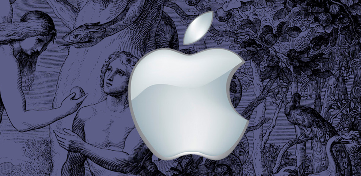
Caption: Apple and the Garden of Eden
Graphic designer Thiago Barcelos applied the Fibonacci sequence, or Golden Ratio to Janoff’s original Apple logo. Though the design did not refer to these calculations, the logo’s underlying structure may subconsciously explain why Apple’s brand may have endured the test of time in a rapidly moving industry.

Caption: Apple and the Golden Radio
The Logogenie Design Challenge
Logogenie’s third generation free logo maker allows you to specify your company’s industry and preferred font type. Through three steps, you can personalize your logo through your company name and baseline, or slogan. First step: enter company details. Industry choices have a wide range, including construction, fashion, technology, wellness, food, transportation and more. Step two: choose a logo template. There are hundreds available, and following your choice you may preview and download. Customization is made through unlimited modifications. Layout, color palette, fonts and symbols can be altered. Step three: a high resolution download is made available, and in many formats. The logo design is compatible with programs, such as Adobe Illustrator and Photoshop.

Caption: Design your own logo using the Logogenie logo maker
Logo design is made easy through clear tabs to the left, with options to further design through icons, details and symbols, color palettes, and placement. Logogenie’s easy-to-use “undo” and “redo” options on the left allow for vast experimentation. There are new options, such as the social network option, resizing for specific social platforms and easier branding, as well as the exclusivity option, which gives you rights and contract offers to copyright.
To the right, the helpful “recenter” tool is there to keep everything aligned should you choose to do so. Next to the “recenter” tool, you can find the “help” option, where all tutorial videos are easily accessed to assist with questions that might come up during the design process. Amongst the videos, there is a quick introduction on how to use Logogenie’s design tools. The videos also explain how to modify text, applying appropriate usage of colors and gradients, and tips on including special details to your logo design.
Online chat is available at any time, should you have questions about this part of the game. Have fun!

