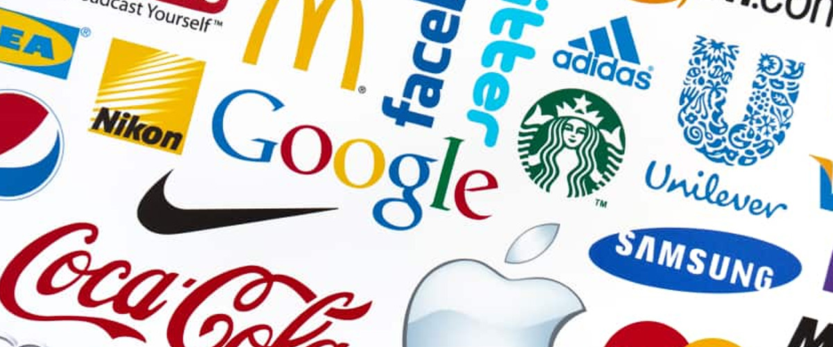
A company’s visual identity can break, make, or help them fly all the way to the top. A company or brand’s logo design is in fact one of the most important aspects of their visual identity. Not only does it distinguish one brand from the other, but it has the potential to enhance how the company performs, influences customer choice, creates loyalty and builds brand value. These are all powerful moves that brands have the potential to make. If you’re deciding on your own brand name, you should consider a process called ‘brand name testing’ to ensure your target audience resonates with your brand name, almost as much as they do with the logos below!
The International Organization for Standardization, an international body composed of representatives from various national standards organization founded in 1947, promotes worldwide proprietary, industrial, and commercial standards. The organization’s protocol for estimating brand value falls on six key requirements: transparency, validity, reliability, sufficiency, objectivity and financial, behavioral and legal parameters. Brand value goes hand-in-hand with reputation, which also helps dictate success. Maintaining a positive brand reputation is critical for overall success in a business.
Previously, we’ve explained aspects of a logo, while outlining the reasons why authenticity is so important for the design process. Now, we’ve handpicked ten of the world’s most recognizable brands of the world to go into the history and logo design evolution in search of answers for what has made them so successful. The ISO would be proud.
Coca-cola

In the spring of 1886, Atlanta pharmacist John Stith Pemberton produced a syrup that would change the world. Things escalated quickly enough once the local community gave raving reviews. Pemberton’s bookkeeper, Frank M Robinson, came up with the name Coca-Cola, suggesting that the two C’s would look well in ads. Robinson designed the company script by experimenting with an elaborate Spencerian script, set on including a dramatic look to the name he just gave.
The red and white color palette we know and have had ingrained in our cultural landscape has more to it than traditional qualities. Red portrays power, excitement and energy. The color itself triggers impulse purchasing, with studies previously done to prove that poker players with red chips bet more than those with blue chips. The passionate white and sweeping cursive text suggests a time of the past, a burning nostalgia. The palette coincidentally matches the suit of Santa Claus, who has since become a Coca-cola mascot, connecting more tradition with the iconic brand.
Fast forward to present day, where Coca-cola takes the rank as the largest beverage manufacturer and distributor and even more, one of the largest corporations in the world. 1.9 billion servings Coca-Cola products are sold worldwide every day, compared to just 25 bottles in its first year. With its trademark officially having been registered in 1887, there have been only slight changes, making Coca-cola a deserving brand of the world coinciding with stability and tradition.
Pepsi
Before Pepsi, there was Brad’s Drink. Created by a pharmacist in North Carolina, Caleb Bradham brought this medicinal aid to life in 1893, just a few years after Coca-Cola and a few years before Dr. Pepper emerged. Five years later, Brad’s Drink became Pepsi-Cola, a name derived from another word for indigestion, that being “dyspepsia”.
Pepsi has been one brand which has defied the equation of what makes a timeless and recognizable brand: consistency. Over the century in which Pepsi has existed, there have been twelve significant logo redesigns, not counting smaller products and flavor variations. Despite these ongoing changes, Pepsi has promised one thing: satisfaction. Their red, white and blue hues have created a clean and aesthetically pleasing logo through intentional curves and circles. Twitter’s creative director stated the overlapping circles called to the potential networks, interests and ideas to be made, to be connected and intersected amongst peers and friends. It’s current-day golden ratio-approved logo is still recognizable despite the company’s ongoing constant evolution.
McDonald’s
McDonald’s is America’s number one fast food company, founded in 1940 as one single restaurant. Over time, those golden arches which make up McDonald’s “M” have become synonymous with our collective idea of convenient food. Those arches have become so much more, symbolizing fast food culture and America in a specific way.
The brand has gone through a few redesigns since their inception, but have held onto the same concept for decades. Those iconic arches were based on one of the original restaurant designs which included separate golden arches, which looked like an “M”, over the building.
Nike
Nike is the most valuable fashion brand in the world, with its swoosh being one of the most iconic brand identities existing today. The logo, originally designed in 1971 by a student of Phil Knight, one of the founders of Nike. The designer, Carolyn Davidson was paid $35 and Knight was quoted as saying, “I don’t love it, but it’ll grow on me.”
Davidson took inspiration from the Greek goddess of victory, Nike, modeling the logo after her wing. Greek folklore narrates that Goddess Nike influenced many brave warriors to win battles to protect their motherland. The wings of Goddess Nike is said to have brought motivation and audacity to the warriors heading to the battlefield. It was important for the designer to both convey the message of motion and differ from their rival company, Adidas.
Nike’s logo uses the white space around it just as much as the curve itself stimulates movement, where you can almost hear and feel the design. Its simplicity signifies speed and agility, and also allows for it to look good on all of the company’s products, instilling the icon every which way possible.
Adidas

Founded and headquartered in Herzogenaurach, Germany, Adidas has come to represent elegance and durability. The brand has single handedly pioneered minimalist, corporate logo design. The three-stripe mark has become the quintessential Adidas symbol.
Adidas bought out the three-stripe trademark from a Finnish brand in the 1950’s and the iconography was created by the company founder, Adi Dassler. Dassler first used these marks in the brand’s footwear in 1949, when he especially wanted to create a symbol that could be immediately recognized in athletic competitions. Though a simple design, this became so viciously associated with the brand that Dassler even called his business “the three-stripe company.”
For a bit of background on the design itself, it’s easy to recognize that the stripes form into the shape of a mountain. This is meant to inspire and challenge clients to push themselves to reach their full potential.

Google is synonymous with many of our digital inquiries, including the internet (!!!). They’ve made our list for a reason. The American multinational technology organization which specializes in Internet-related services and products has the best reputation of any company in the US and is currently one of the most recognized brands in the world. Google actually had two logos in the beginning.
In 1996, the Google logo featured an image of a hand and the company's original name (BackRub) in red font. Once they rebranded to Google, they launched a much more simple logo in 1998 which exclaimed "Google!" in a multicolor hue. Ruth Kedar was the graphic designer behind the now-famous logo.
"We ended up with the primary colors, but instead of having the pattern go in order, we put a secondary color on the L, which brought back the idea that Google doesn't follow the rules."
There’s been a lot of discussion around the imperfections around the current logo, and UK designer Will Patterson gracefully explains why the Google logo is optically perfect despite its mathematical and geometric imperfection.
Facebook was founded in 2004 and has helped to give people the power to build community while bringing the world closer. What started as a small and very local website in a college student’s dorm room has since expanded to THE social media giant we know today.
When Facebook began to evolve from a university networking site to a worldwide social media platform, founders Mark Zuckerberg and Sean Parker hired Mike Buzzard of Cuban Council to create a new logo for the company. The logo Buzzard designed is nearly identical to the logo associated with Facebook today, as the company has made only minor changes over the years. The blue color scheme of the logo was chosen because Zuckerberg suffers deuteranopia, a form of color blindness. One color that someone who suffers from deuteranopia is able to easily distinguish is blue.
The Facebook logo is simplistic and straightforward design-wise, with white lowercase font on a calm, blue background. Even though the scheme was chosen because of Zuckerberg’s condition, there is still significance for the color scheme itself. Blue and white have long been used in combination to represent purity and optimism, which is something Facebook was striving for as a brand.

“Twitter is the bird, the bird is Twitter,” the social networking company’s former creative director, Doug Bowman stated.
Their signature icon has been long distinguishable from other platforms, coming a long way since the beginning otherwise known as “twttr”. Twitter’s official launch was on July 15, 2006, when the founders enlisted Swedish graphic designer Linda Gavin to develop the first official logo in one day. The branding remained the same until 2010, when it evolved to how we know it today through Martin Grasser’s eyes. His design, the current logo, is based on a hummingbird, with its illustration based on fifteen circles. Grasser stated that the circles symbolize the idea that Twitter democratizes information and gives everyone a voice, to convey a neutral visual. Twitter’s former creative director called the visual identify shift the “ ultimate representation of freedom, hope and limitless possibility.” The platform communicated how simplification can be a sign of success.

CEO and co-founder Kevin Systrom had no idea Instagram, the photo sharing social platform would grow into a massive international network. Once Facebook bought it out in 2012, Instagram became one of the most active social media platforms in existence today.
All of their logos have been based on the shape of an instant camera, which looks back to the network’s key designation of sharing photographs. The original Instagram logo from 2010 was designed by Systrom, and was a knock-off of a Polaroid camera with a rainbow stripe. Now, the Instagram logo is a minimalistic sunset-colored outline of the original Polaroid camera image. The switch from a distinctly analog camera to the minimalist digital illustration it is now caused an uproar from their existing community, but memorability and recognizability still remains.
Amazon

We’ll end our list of brands of the world with a banger: Amazon.com, Inc. The American multinational technology firm based in Seattle, Washington is an e-commerce, cloud computing, artificial intelligence and digital streaming tech company, now considered one of the “Big Four” companies along with Google, Apple, and Facebook.
The founder of Amazon, Jeff Bezos, hired Turner Duckworth to create the Amazon logo. Initially, the logo was the letter ‘‘A’’ with the shape of a river inside. Replaced in 1997 with more detailed text (including‘‘amazon.com'' with the slogan ‘Earth's Biggest Bookstore’). The logo we know today with the yellow line was adopted in 1998, depicting a message that they sell everything from “A to Z”.
Need branding for your next business

Logogenie’s third generation free logo maker allows you to specify your company’s industry and preferred font type. Through three steps, you can personalize your logo through your company name and baseline, or slogan. First step: enter company details. Industry choices have a wide range, including construction, fashion, technology, wellness, food, transportation and more. Step two: choose a logo template. There are hundreds available, and following your choice you may preview and download. Customization is made through unlimited modifications. Layout, color palette, fonts and symbols can be altered. Step three: a high resolution download is made available, and in many formats. The logo design is compatible with programs, such as Adobe Illustrator and Photoshop.

