As much as some of us try to fight it, the world changes every day. In some cases, jokes that were funny 10 years ago are offensive now, and as we’ve all witnessed, trends come and go, sometimes coming back again.
Your business isn’t immune to the changes that are happening in the world. Maybe you started your business when the internet was in its infancy and now, you’re offering ecommerce alongside your brick and mortar location. Or maybe you inherited the bakery your grandparents founded and operated for decades. When they started the business, they never would have imagined offering vegan or gluten-free options and couldn’t even conceive of customers ordering pastries through an app and having them delivered right to their doors. But today, those are key parts of your business plan.
In either one of those scenarios, a new logo is an effective way to show the world that your business has changed to fit with the times. But is it better to replace your logo with a new one, or make changes to your current one to give it an updated look? As with lots of other questions about logo and other graphic design best practices, the answer is: it depends on the situation.
Reasons to Change or Update your Logo
There are lots of reasons to change or update your logo. At a glance, here’s a few:
• You’re taking your local brand national
• You’re taking your national brand international
• You’re pivoting to serve a different demographic
• You’ve changed your business model
• You’ve changed the kinds of products you offer
• You’re merging with another company
• You’re launching a new to your business, like an online store to complement your existing brick and mortar shop
• Your current logo looks outdated
Your logo is your brand’s public face. It needs to accurately describe your brand in a single image, which can be challenging. But there are subtle ways to depict your brand persona through font choice, color palette and even the shapes you opt to use in your logo. If you’re not familiar with these, take some time to read our blog posts about them.
When your business changes drastically, it’s likely your logo won’t accurately describe it anymore. For example, if you’re a small storefront takeout counter that’s expanding to a full-service restaurant, the cues you used in your logo to tell the world you offer easy, quick meals at an inexpensive price point, like circles and a sans serif font, aren’t sending an accurate message anymore. In fact, diners looking for a more upscale sit-down experience might pass your restaurant over because when they see your logo, their first thought it “takeout counter.”

Sometimes, it’s not so much your business that’s changing, but the demographic you’re aiming to reach. Maybe you run an auto body shop. Knowing that cars are generally considered to be the “man’s domain,” your logo is a dark blue octagon with a bold font. But after years with that logo and realizing you’re losing money by not reaching female drivers, you decide it’s time for an update that takes your logo in a more gender-neutral direction. Your business didn’t change, but how you present it did in order to connect with people you weren’t previously reaching.

And then there’s the issue of merging your company with another. Whether it’s an equal merge, your brand is acquired by a bigger company or you’re the one doing the acquiring, generally a new logo is in order. For many companies that have gone through mergers, the answer here is to create a logo that incorporates elements of both brands’ logos, like ExxonMobile kept Mobile’s signature red color in the logo redesign after the two brands merged.

So as you can see, there are lots of reasons to change your logo. Another reason to update your logo is if it simply looks outdated. If your company’s been around a while, there’s a good chance your logo contains some older design trends. Maybe they give your logo a cool vintage look, but maybe they just make it look like it’s past its prime.

It’s not always as easy to tell when a logo’s simply outdated versus no longer accurately depicting its brand. One way to gauge if your logo is getting long in the tooth is to compare it to other logos in your industry. Does yours look markedly older? If so, it’s probably time for a change.
But wait – some famous logos never change. A prime example, the Coca-Cola logo, has been basically the same since 1886.

Maybe your logo doesn’t need to change. Maybe it’s perfect as it is and communicates your brand persona as strongly as it did the day it was first designed, even though your business has grown and evolved in the years since its inception. If that’s the case, congratulations! You’ve got a timeless logo.
But how can you really tell if your logo is timeless enough to stay the same as your business evolves? Read on to learn more about the considerations to make when you’re thinking about a logo facelift.
What to Think About When you’re Thinking of Updating your Logo
When you’re thinking about updating your logo, ask yourself a few questions to determine if it’s the right choice:
• Does my current logo accurately depict my brand?
• Is my current logo resonating with my target audience?
• If I could redesign my logo right now, how would it look? Does this redesigned logo look like the logo you’re currently using?
So the next question is, is it better to introduce a whole new logo, or just tweak the one you’ve got now? The answer? Again, it depends.
If you determine your current logo is sort of working or could be working better, it’s probably best to go the facelift route. This is also true if you’re not changing your business’ name or your business model. By simply tweaking your logo to make it more in line with today’s trends, you avoid potentially alienating or confusing your buyers.
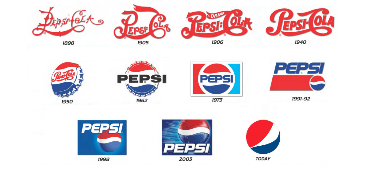
If your brand is undergoing a major change, like a new name, a new business model, drastically different offerings or entering a new market, you’ll probably need a more extreme logo change. In this case, starting fresh is probably the way to go.

Ways to Adapt your Logo
If you’re going with a logo facelift, brainstorm ways to freshen it up without changing the core elements that made the original so great.
Sometimes, all your logo needs to feel fresh is a simple palette swap. You might not even have to change your colors, just the shades of your colors, like Visa did when they redesigned their logo.

Another way to update your logo is to change out the font. You might go with a more rounded, more modern-feeling font, or you might choose to take the logo in a different direction and give it a serif font to add an air of sophistication.

You can also remove an element in the logo to let the wordmark or the image stand on its own. For example, the Nike swoosh is immediately recognizable nearly anywhere. It doesn’t need the Nike wordmark, it stands on its own just fine.

Starting Fresh with a Brand New Logo
When there’s just no realistic way to update your old logo to fit your new brand, you’re best off creating a whole new logo. Lots of famous brands have done it – sometimes, you’ve got to completely reinvent yourself to stay relevant in today’s world.

A new logo can keep elements from your old logo, like AT&T kept the same shade of blue they used in the 1969 version of their logo when they switched over to the globe. This way, you keep some tangible piece of brand recognition when you redesign, but you’re not stuck having to fit your old logo into your new brand identity. But if this approach doesn’t work for your brand, don’t try to force it. Sometimes, you need to completely wipe the slate clean and create something brand new.
When you’re creating a new logo, start from the ground up. Ask yourself the same questions you asked yourself when you designed your first logo, like:
• Who is my brand for?
• What product or service do we provide?
• What sets us apart from our competitors?
• What are our core values? How do we operate according to those values?
• What do buyers expect from this brand?
Then, start working out some designs based on your answers to these questions. As we mentioned above, design elements in your logo like the colors you use, the shapes you use and your font choices subtly tell the world what your brand’s all about and what they should expect from you. Think about your brand’s personality and determine the design choices that communicate that personality, like a saturated shade of green for a trustworthy lawn care business or a light blue circular logo for a children’s salon.
Remember, whether you simply update your logo or you take the brand-new logo route, you need to budget for the change. Your new logo is going to go a lot of places: your website, your business cards, your signage and every advertisement your company creates. Any logo redesign is going to take time and cost money to replace the old logo on branded assets.
Fortunately, designing a brand new logo doesn't have to cost you much. With Logogenie’s ogo maker, you can create your own professional logo in just minutes, no design or coding experience necessary.

